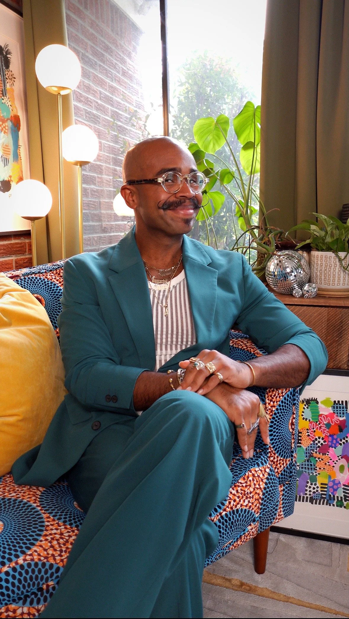
A Home Curated by Connection and Culture
I’m back with another home transformation! And this time, we got a chance to curate a home through familiar connection and celebration of culture! So you know my go-to design quadfecta came heavily into play with this project: color, texture, pattern, and art!
But, before we get into the details of bringing this colorful project to life, let’s take a look at the home before we got to work!
In the Beginning
Upon entering the home, we stepped into a sunbathed foyer that displayed a piano that holds sentimental value for the family. From our initial conversations, once I got to know that the family had a love for music and art, I knew that this space would have to be a reflection of that love; a celebration, even, that would greet guests upon entering the home.
Another request for this space was to incorporate an area for reading, reflecting, and simply starting and finishing the day with ease! If you’ve been following my projects for a little bit, you’ll know that I live for curating spaces to make them feel as calming as they do, invigorating! And this project will be no different. I can’t wait to show you how we brought the family’s wishes for this space together!
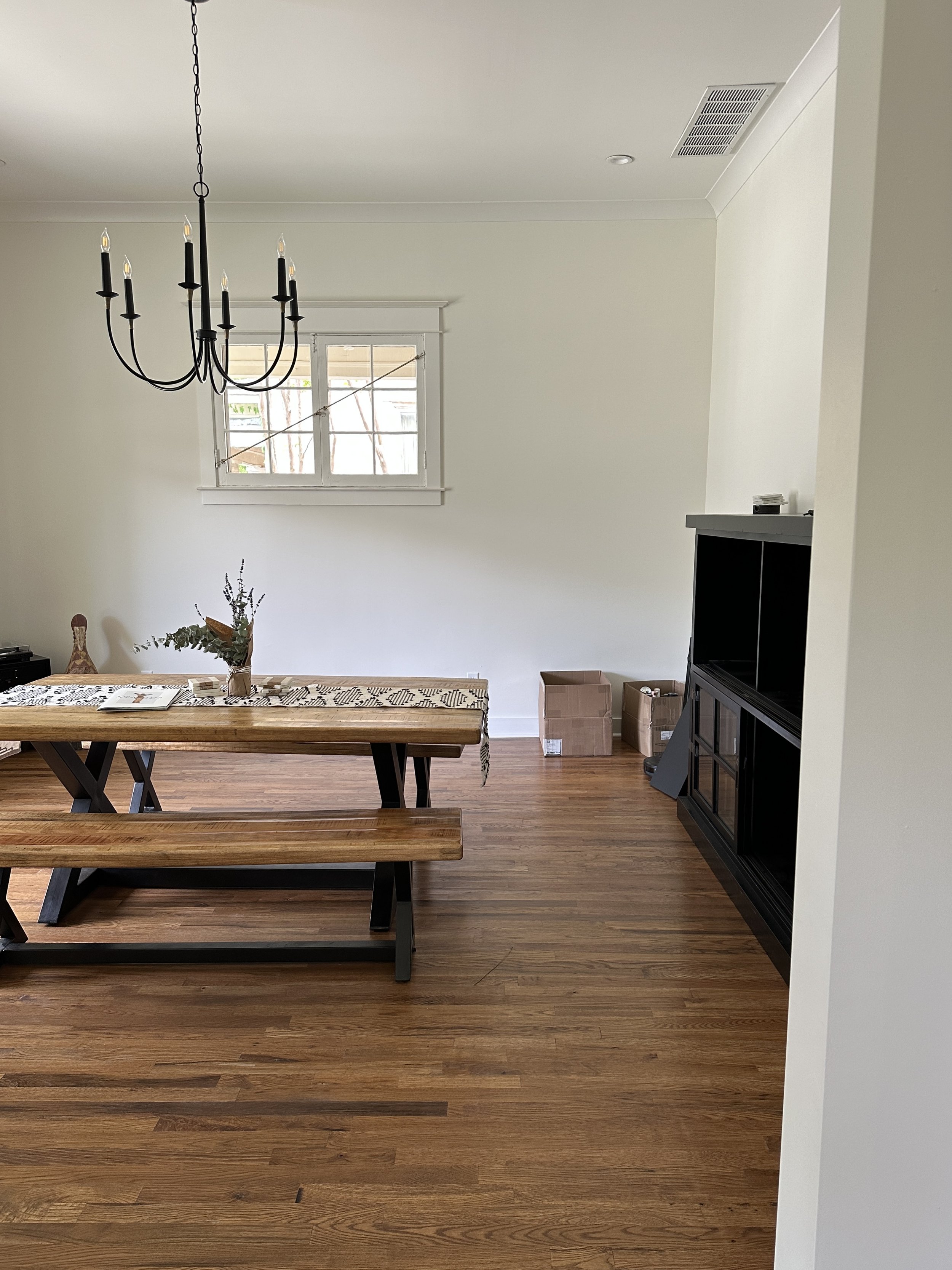
Right off the foyer is the dining room. For this space, we were tasked to create a dining parlor . . . a room that would lend space to family and friends to enjoy a good meal, good conversation, great drinks and vibe out to music. And since this century-old home had been recently renovated, I knew that I would want to restore some of the old home charm common to this era while maintaining an updated feel. We were in for some fun designing this space!
You already know I love to create a moment to remember for powder rooms! And thankfully, the family was equally as eager to have a powder room that exuded their personality and love for all things beautiful!
Again, walking into this home, we had a beautiful blank space to create in. Given that this home is situated in a historic district, we prioritized layering in tons more character while continuously weaving nods to the home’s age throughout each space! In the open-concept living room and kitchen, the family requested that this space serve two functions: provide a comfortable place for family and friends to gather while also allowing space to settle in after a long day’s work or lounge in on the weekends! The FUN we had in this room!
Just wait until you see what we did to this wall in the living room!
With a few minor cosmetic changes, we would be able to make the feel of the living room effortlessly flow into the kitchen. This space will be where we show how a little paint, a touch of color, and a switch of hardware can make all the difference!
For the last interior space, we proposed that this space serve as a reading and reflection nook! We wanted to play upon the coziness of this space, creating a sense of privacy in plain sight. And since at this time I’d recently hired my design assistant/project manager, I was able to step into my new role as Creative Director of Studio 417 by having her design this space. Just wait until you see what Jurnee did!
Lastly, we’d continue the vibes from inside the home to outside, adding a little warmth and personality to their patio!
Details in Planning
The dining parlor is the first major room you encounter upon entering the home, and is we’d really be able to continue the storytelling of who this family is. So, in this space, we wanted to introduce pattern and textural play through the wallpapered ceiling and the textiles sourced. And to develop the color story, along with the family’s playlist, I pulled colors from the wallpaper to beautifully communicate the vision for the dining parlor.
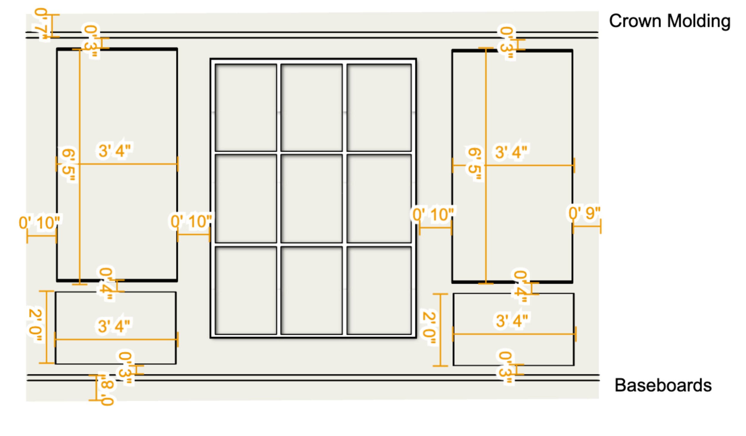
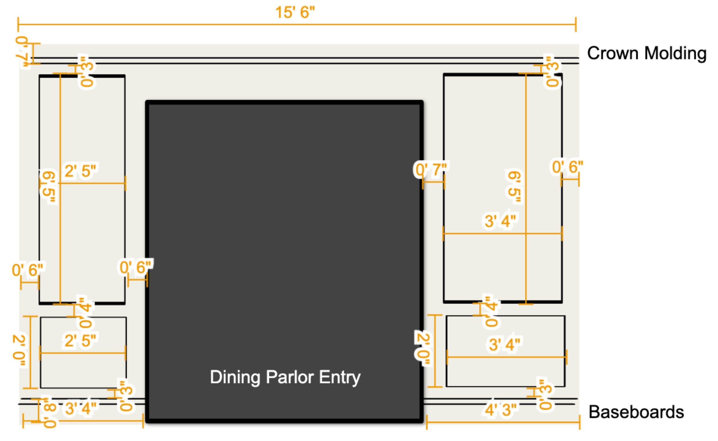
As mentioned at the onset, I wanted to lean into the age of this home’s age, especially in the parts of the house that had been renovated to reflect a more plain and modern feel. To restore some of that old charm, I speced out wall molding; a detail traditional to dining rooms in these homes during the 20’s and 30’s.
To celebrate a colorful connection to culture, we sourced patterns and prints that reflected the homeowners’ heritage, making use of sentimental furnishings they wanted to keep. We love being able to design around pieces that have heart value!
Above are two of the four elevations I developed for the dining parlor and gave to our construction team to use in the buildout of this space. Since this was the first time I and this particular team worked together, and I was headed out of town for an install in New York, I wanted to make sure I provided as much detailed information as possible for the crew. With the exception of a couple of measurements that needed to be corrected, these elevations facilitated the production of this project, forming a stronger bond with the team and I as I reassured them that I would never be gone from a site without providing plans to set everyone up for success!
How Did We Do?
Photography: Sarah Rossi
Pulling from the family’s collection of art, sculptures and family keepsakes, we used the entryway wall to create a gallery wall. This wall now serves as a visual representation of who this family is, and what makes them feel whole! This allows guests the first opportunity to get to know the beauty of this family and their story.
Photography: Sarah Rossi
We used this corner in the entryway to create a comfortable space for reading and drinking coffee (or tea) in the morning while planning the day. To achieve the vibe of elevated comfort, we picked a low-sitting chair in an olive green boucle fabric, placing a table equal to the seat’s height for ease when reaching for beverages or reading material.
Photography: Sarah Rossi
With the homeowners’ vision as the priority, the dining parlor was designed to serve as much as a formal dining space as it would be a place to convene to listen to music while craft cocktails are being served.
Photography: Sarah Rossi
THE Bar
One of the items on the homeowners’ wishlist was a bar! So, when our clients have a wish, it’s our goal to make that wish come true! For us to achieve a functional layout for the dining parlor while maintaining the hotel lobby vibe the clients envisioned, we decided that going custom for the bar would be the best solution! And since we’ve worked with this artisan before, we knew we had to commission this bar from none other than Olivia Green! Y’all, her work is nothing short of amazing - always!
Also, we loved being able to collab with Liv on this project because, right on theme with connection, she happened to be good friends with the homeowners and we might have kept her involvement a surprise until the fabrication started up!
Photography: Sarah Rossi
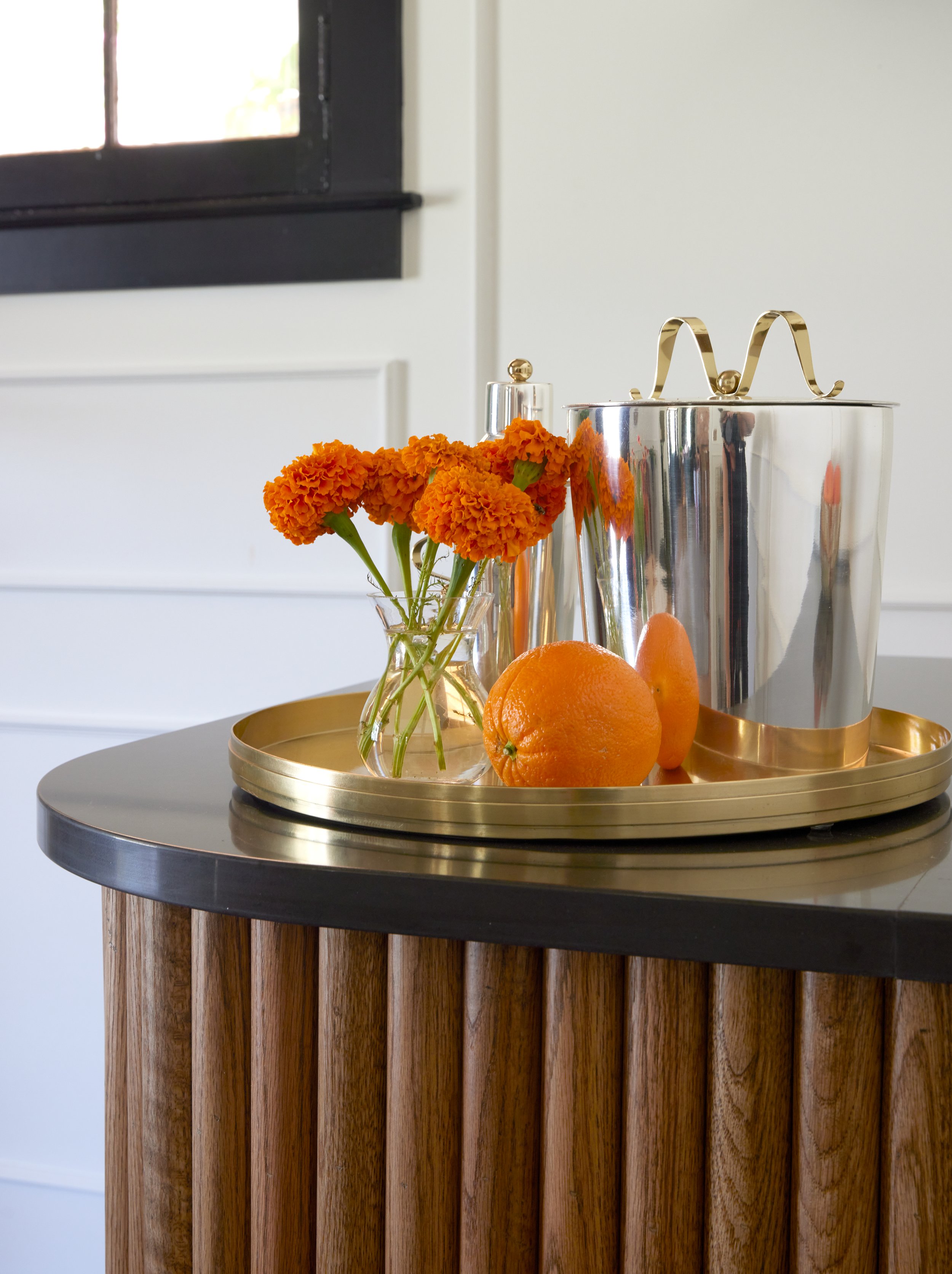
To achieve an approachable, yet luxurious look for this bar, we requested that the bar’s facade be fabricated of reeded wood and stained American Walnut - a classic stain color befitting of the home’s age. And for the countertop, we sourced a dark quartz for contrast and durability while creating craft cocktails, as quartz is commercially viable and withstands stains - from things like lemon juice - and is durable enough to resist cracks and chips.
Photography: Sarah Rossi
Although custom fabrication can be quite an investment, we source to shop high-low - in materials and furniture where applicable. So, instead of sourcing a complete slab for this bar, we visited one of our favorite stone yards, Countertops of Memphis, and happened up on this beautiful quartz! For their access to distinct slabs, and because I love to support local businesses, I make sure to keep this company top of mind when sourcing for projects!
Photography: Sarah Rossi
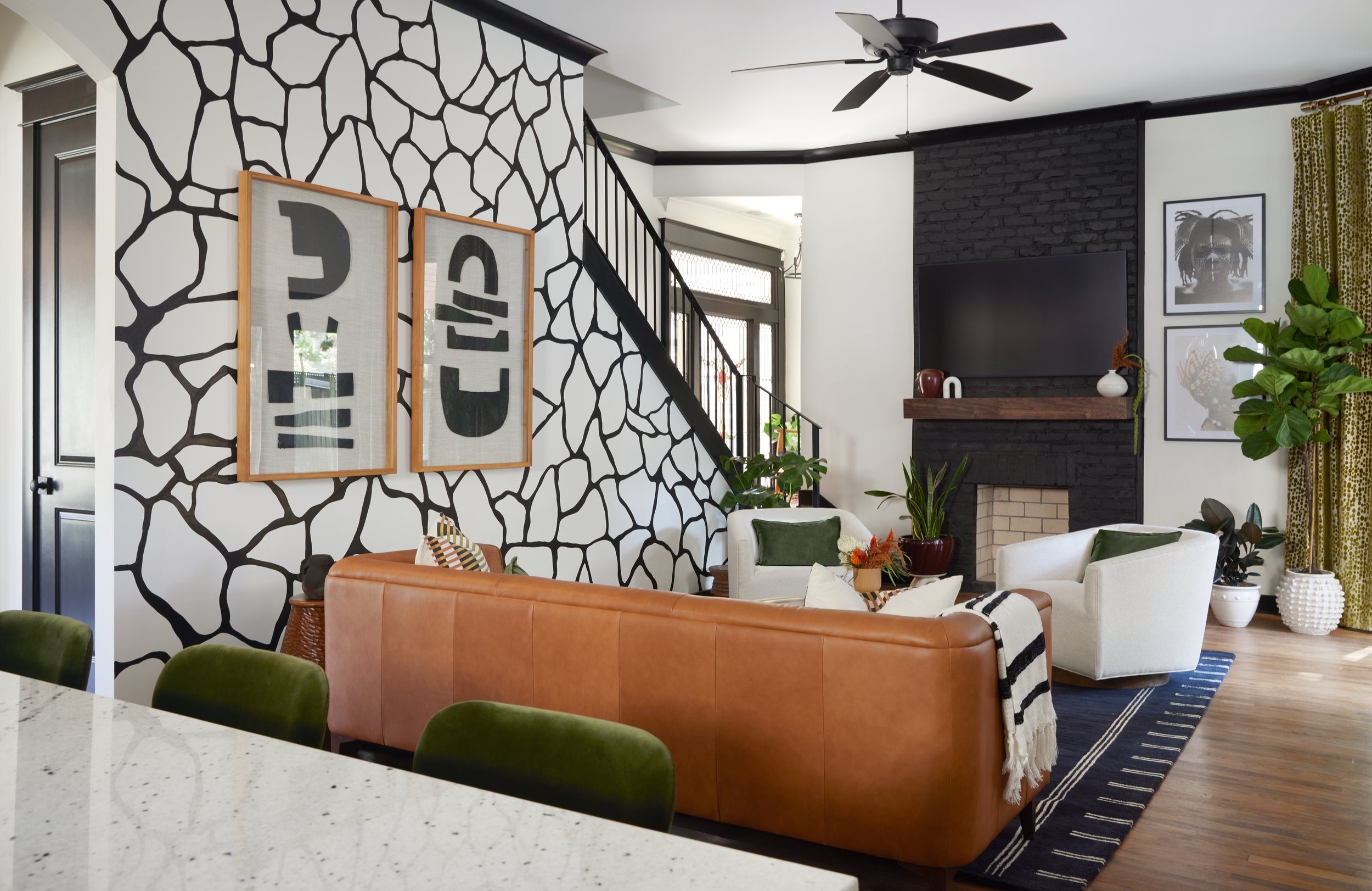
Continuing the color scheme from the dining parlor, entryway - and powder room; we’ll get there in a minute - the living room was a dream to design! The goal here was to breathe a whole new life into this space, without having to make many structural changes.
Although we faced a little challenge with relocating the fan - it’s original position in the room was a bit awkward - we let the cosmetic work done do the heavy lifting for making this space feel like our homeowners vision!
Photography: Sarah Rossi
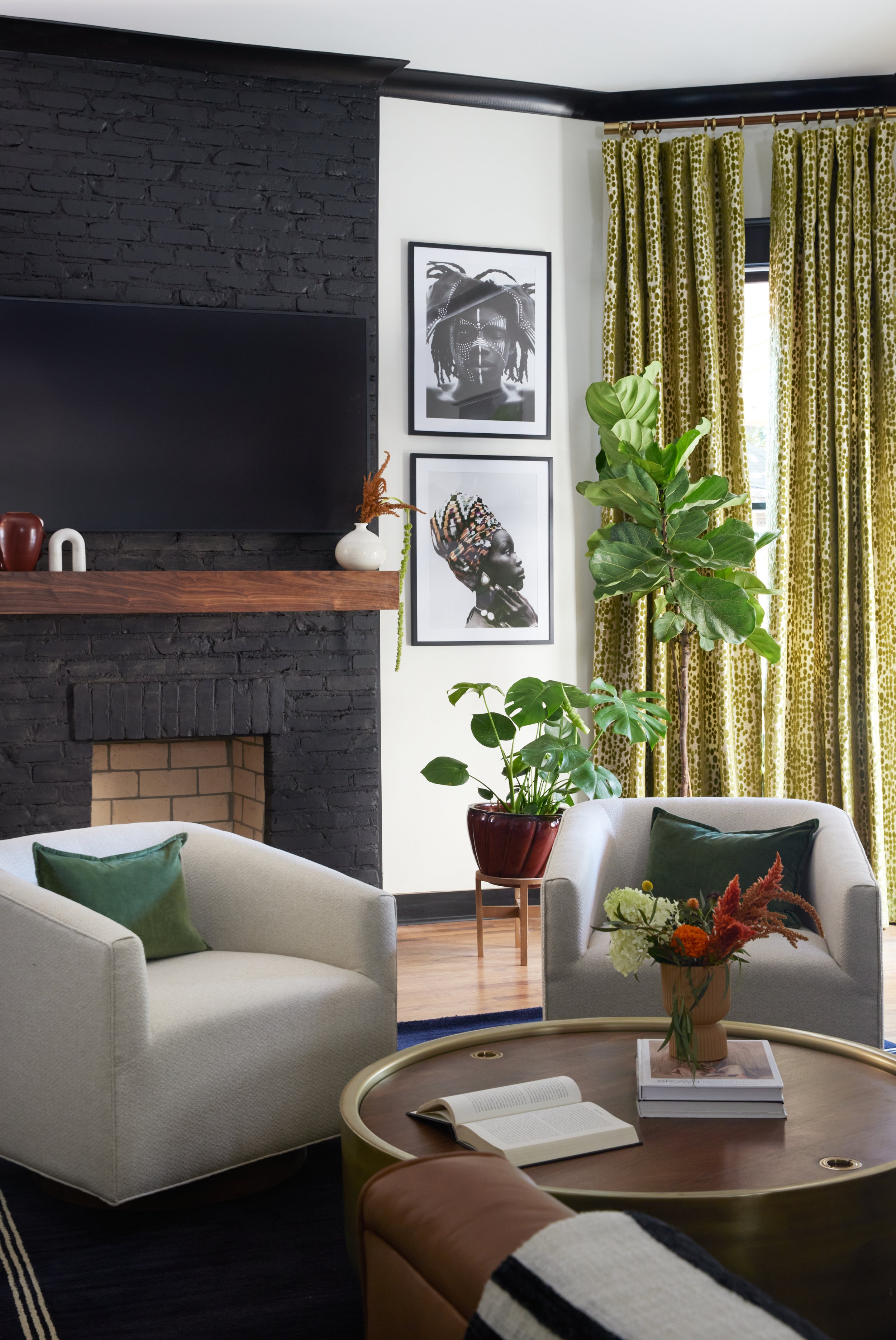
One of the ways we creating focal contrast in the living room was painting the fireplace Tricorn Black - my favorite shade of black by Sherwin Williams! By keeping the color palette simple, the “color conversation” of greens, rust, blues and linen flowed effortlessly throughout the home.
Liv also fabricated the mantle. And because form and function is part of my alchemy, the front of the mantle folds down, creating storage for remotes, cords and anything else one may want to keep out of sight.
Photography: Sarah Rossi
We can’t leave this room without talking about the mural! In the original design of the living room, I wanted to rely on the artwork for bringing in additional layers of personality and culture. But one day while sitting poolside on vacation in Puerto Rico, I randomly remembered a consultation note of the client mentioning their connection to fauna and nature in general. So, to incorporate cultural and nature in a seamless way, while creating impact in the space, we commissioned Kelly Miller to create a mural of an inverted giraffe pattern! THIS was the oomph I was looking to add in this room!
Photography: Sarah Rossi
You may recognize Kelly’s work from our Real Estate Office project earlier in the year. I’ve never seen anyone who can freehand a mural while taking your original vision to the next level until meeting Kelly! Along with the multi-media art in the room, the homeowners now have a unique piece of art in their home from an artist who thrives in right here in our community!
Photography: Sarah Rossi
The color palette and mural continues right into the kitchen! And the magnolia branches . . . let’s just say we foraged them! (Tehee)
Photography: Sarah Rossi
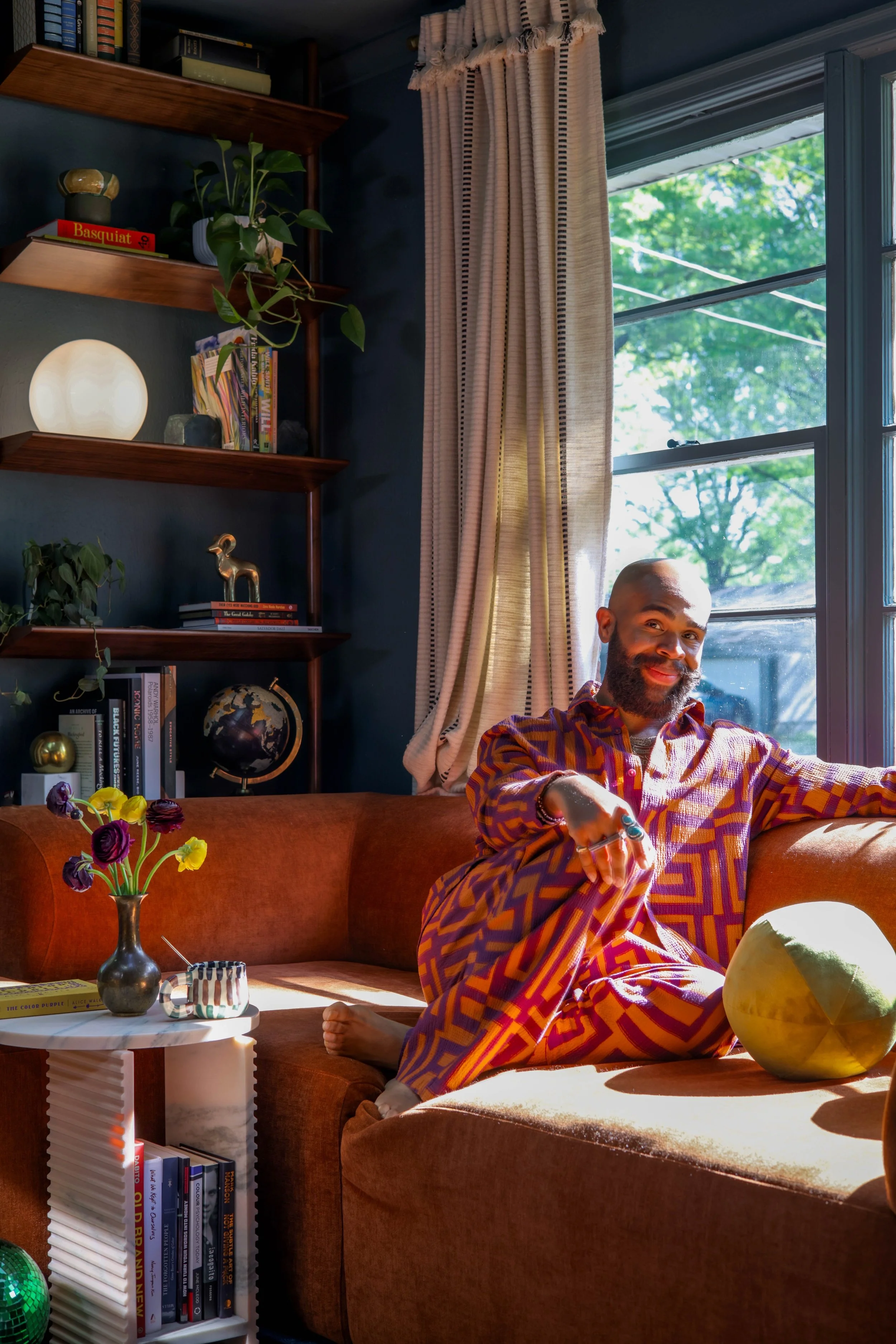
Another particularly special space is the reading nook! As many designated areas for entertaining the requested by the homeowners, they also wanted to balance those spaces with areas of respite. And this reading nook is now the perfect place to settle in and read for hours while basking in tender sunlight.
What makes this space even more special is that it was designed by Jurnee - and might I include her first design assignment with me! I couldn’t be more excited for and proud of Jurnee. With a vast knowledge of graphic design, she’s been able to apply her expertise to designing spaces. And this one is proof of the magic she creates!
Photography: Sarah Rossi
The powder room was another one of my favorite areas to design! In this space, we were able to make small, yet highly impactful changes by making use of the existing vanity and overall layout.
Photography: Sarah Rossi
Here, we simply painted the vanity, placed new artwork, and changed out the hardware, faucet, and lights. And for added drama, we brought in another one of my wallpapers, Lucille - in faux grasscloth - for an added layer of texture and tactile experience!
Photography: Sarah Rossi
The last area we transformed in this home was their wraparound porch. Because we needed one more space that would serve in duality for providing a separate area for intimate conversations, while offering a moment to retire after a day of work, we created an outdoor living for this portion of the porch.
Photography: Sarah Rossi
For added privacy, we layered the space with palms that would eventually grow higher and wider, allowing our homeowners a bit of seclusion from passersby.
Photography: Sarah Rossi
Another one of my favorite details that furthers the connection to family and heritage is the hammock pictured, which was bought by the late matriarch of the family. Its beautifully woven panels will provide years of reflecting on the love from which it was gifted.
Photography: Sarah Rossi
Working on this project was truly soup for the soul! Often, we go into designing homes and businesses with the intention of providing a service to amazing clients. But when we leave the project with the gift of friendship with the homeowners, that’s something more magical than words can ever explain.
I can’t wait to continue to expand my circle of amazing friends while creating beauty in the world . . . one gorgeous space at a time!
Until the next transformation!
