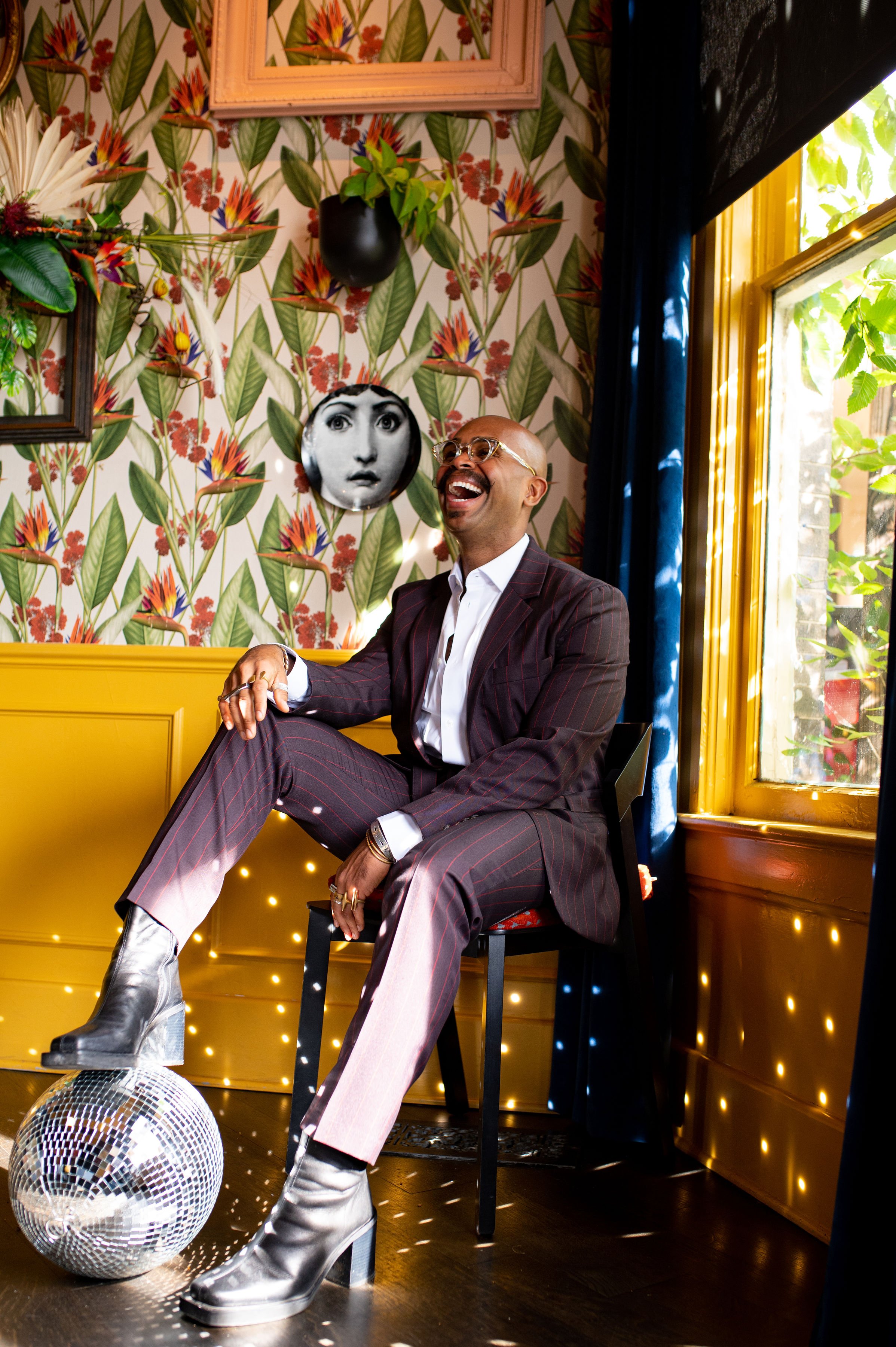
Setting The Mood: A New Era
From light and airy to layered and moody - a living room redesigned.
Before we begin, I know it’s been a while since my last post here! So, just know it’s good to be back! Now, let’s get into my living room redesign!
If you know me, you know that I love COLOR, bright, bold and airy, for the most part, have all been words to describe my home and living room . . . well, until now.
Why the dramatic transformation?
From Light and Airy

Photo: Genevieve Garruppo
I’ve always loved a light and airy aesthetic! Despite my use of bold color in my design work, I loved coming home to white walls, celebrating color through the artwork and accessories in different spaces.
And, just as many of us did during quarantine, I took advantage of the extra time at home to really focus on making my house a home; especially since I’d just moved back in a year earlier due to an artist residency. Once the world opened back up a bit, I started curating my living room by purchasing the rug, media console, and pillows to accent the various colors in the artwork I’d also recently acquired.
This iteration of my living room was a reflection of my style at the time, while prioritizing a free-spirited, comfortable lifestyle through a collection of art and bohemian touches. In this living room is where I celebrated coming into who I was as an interior designer after being published for the first time! In this living room, I rolled up my rug and taught Zumba classes during quarantine. So many memories of getting to know me at the time were celebrated here. And I’ll always love this era of my home and this space.
But, as I continued to evolve, my home needed to do the same.
To Layered and Moody

As the years have progressed, and I’ve continued to study more design styles - really honing in on my craft - I’ve felt a shift in my personal style and taste. How I design is different, how I move in this world is different, how I view spaces is different. So, it was time for my home to reflect that, as well.
I’m still a MCM stan through and through! But, I’ve developed a love for contemporary design, honoring longer-lasting and natural materials through sustainability while celebrating nods to the 70s.
And, can we talk about the color? True to my design style for my clients, I wanted to introduce a bit of the same love of deeply saturated colors into my home!
What’s New?

Here’s a quick rundown of the structural updates made to this space:
Added overhead lighting. Although I rarely use them, sometimes I have a need to see things - like my mail, or while I’m packing for trips - while using more light than my lamps in the space. So, I got four LED, puck lights installed. It was important to me that I spaced them out evenly to illuminate the room when needed without detracting from the overall, more moody aesthetic.
Removed the shutters from the windows. To be honest, I’ve wanted to remove these shutters for some time now. But, they provided a level of privacy I enjoyed while still letting in some light. Too, they were seen as a great feature to have in a home . . . but I didn’t love them enough to keep them. Removing them instantly gave the room a more updated look. Now, I can enjoy the overpour of light that comes in through the windows during the morning and afternoon. And now that I have a garden - more to come on that - I can sit here in the mornings admiring my plants from inside during the hot summer months.
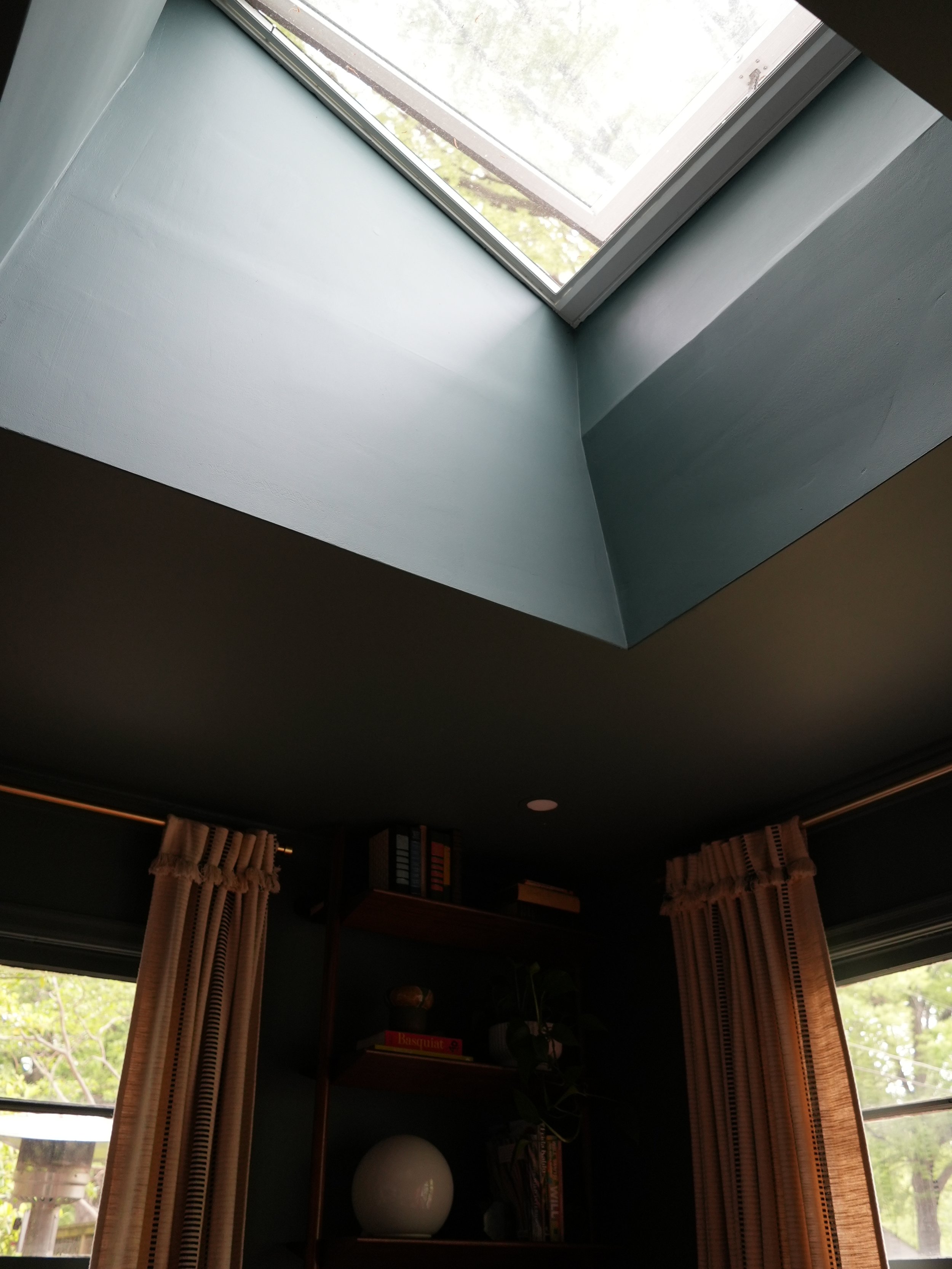
Installed a skylight and removed the popcorn ceilings: I think this might be the most dramatic and my favorite structural change in my living room! Like in my kitchen, I worked with Velux for installing the skylight in my living room. SO MUCH sunlight now pours into this space during the day. And on full moons, I can sit here and view my favorite celestial body from the comfort of my sofa. Did I mention I planned the placement of my skylights along the moon’s path for that very reason?
Moody Elements? Don’t Mind If I Do!
Listen, I’m just as surprised as you that I now live in a darker, moodier space! To be honest, for some time now, I’ve wanted to color drench my living room. But, never having done so in my home, I shied away from the idea. Too, I needed to find the right color to drench it in. Well, I think I did!

The color: Inchyra Blue by Farrow & Ball. I’m super thankful to F&B for gifting me the paint for this project! And this gave me an opportunity to use their new finish, Dead Flat. I’ve never loved the “slap brush/knockdown” texture of the walls in my living room. So by using the Dead Flat finish - which is a bit on the matte side - the wall’s bumby textured appearance becomes less noticeable while maintaining a touch of sheen! I love it!

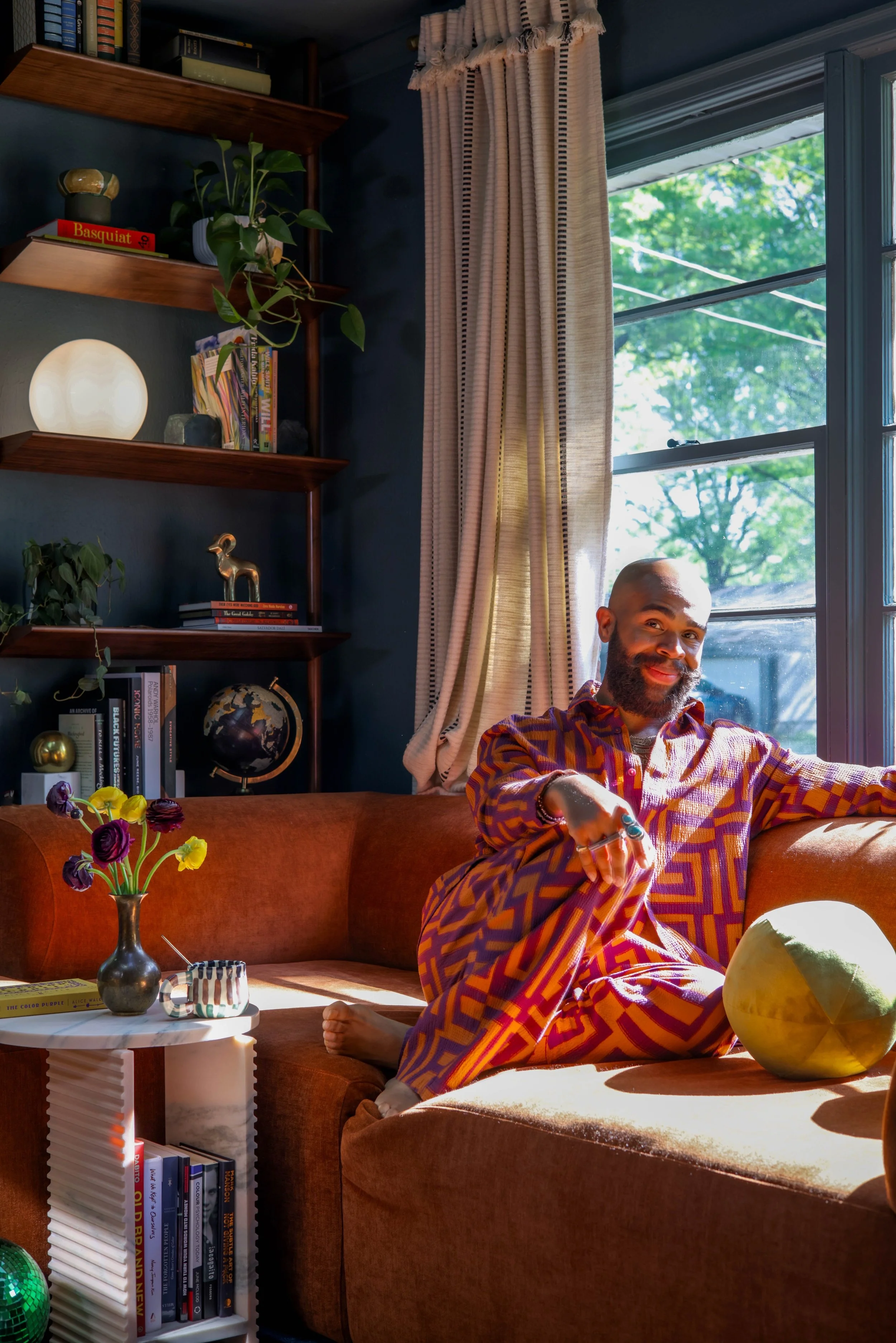
Another way I deepened the mood in my living room is by introducing softer, more luxurious materials like velvet. Thanks to my furniture sponsors at Nuevo, I sourced their Isla Sofa, along with the Lilou Ottoman in terracotta to create the look and feel of a sectional!
And as a full-circle moment: Nuevo was one of the first, higher-end brands I learned to sell when working at a local lifestyle store, Stock&Belle. So, to be working with them again, but in this capacity warms my heart and adds another layer to why this redesign is so special to me.

Too, I chose this sofa for its low-profile back + deep cushion combination. With a more minimalist appearance than my old sofa, this is the perfect back height to keep the view from my window free from obstruction. Too, this velvet paired with the deep cushions encourages naps anytime of the day . . . and let me tell you, I’ve slept here more than my bed as of late because it’s so comfortable! Clean lines are my new fav!
The color? I love the rich contrast of the greenish-blue walls against the terracotta! Since childhood, I’ve loved this color combination! And this color palatte further communicates the depth of the relationship I have with refined design now.
And although we’ll talk about it a little later on, I’m loving this balance of light and dark colors in the room now. For me personally, it helps me tell more of my personality of being a lover of light and joy while appreciating the stillness of the dreamy mystery of darkness.
Because I increased the amount of natural light that comes into the space now through removing the shutters and installing the skylight, I’ve allowed myself a little more freedom with introducing darker colors and heavier, yet soft materials into my home.
Hot tip we’ll address shortly: Do you think dark colors make a space feel smaller?
Personal Touches

The biggest personal touch - literally - that anchors the room is my rug! And yes, MY rug designed with Ruggable and Architectural Digest . . . I still pinch myself knowing that happened! This rug is named after the sea nymph, Nerissa. The design inspiration behind this rug epitomizes the new design direction of my living room: my love of the horizon where the boundless sky meets the imaginable depths of the endless sea. Mixing light and dark, I wanted to capture the feeling of standing eye-level with the oceans water, as you get glimpses of the sky and water. Hence, me naming it after a sea nymph and what she’d see throughout her adventures.
Too, the framed design encourages gathering, much like in conversation pits reminiscent of MCM design. Another reason it’s a perfect rug for living rooms!

Photo: Andrew Puccio
Y’all know I LOVE art! Many times, I will base an entire room’s design off a piece of art. I wanted to maintain the gallery-lover’s feel of the last iteration of my living room by introducing more storytelling art.
Might I add, this piece - unknown title and artist - is the first piece of artwork I’ve had professionally framed. So it’s super special to me because I’ve always wanted to have locally-framed art in my home! As the piece itself, I actually won it at an event called Art Dash, here in Memphis. Upon making a donation towards the event and charity, you receive a number. After having checked out the entire collection of donated artwork, numbers are called; and upon hearing your number, you dash to find the piece of art you loved most during the night!
I loved this piece so much for its color, material, story of Egyptian culture with a nod to living in Memphis (but Tennessee), and how it’s as refined as it is playful! By framing it in walnut and on a canvas-colored mat, this piece lives perfectly against the deeply-colored walls given the neutral breathing room of the framing materials.

Pictured: Star Side Table | Nuevo
Because everything with me has a story, and I’m wanting to continue introducing sustainability into my design practices, I decided to keep my Soto Chair from Joybird, which was my first furniture purchase from a finer brand when I got my first job in design! I saved up for this chair, and loved it for its classic MCM design. The cushion’s color before was a green tweed. No longer matching the vibe of the room, I simply purchased a new cushion cover for the chair rather than replacing the whole thing. This way, I gave new life to a cherished piece of furniture. The color of the cushion is Plush Mist.
This chair has a story to continue to tell - more to come in 2025 . . .

Still staying true to my design core, there are nods to traditional mid-century modern design throughout the entire space, like this replica Nesso lamp from Amazon. To be honest, once I discovered that the original Nesso lamps, too, were made of acrylic, I didn’t feel as bad for purchasing the $50 dupe, saving myself $450. It’s all about balance over here, bb!

I also added a bookshelf to the design - thanks to the suggestion of Jurnee, my team’s Project Manager and Junior Designer. I initially wanted to place another piece of artwork in this corner with a wall-mounted lamp. However, by installing the bookshelf, this created the perfect intersection of form, function and purpose. The design of this bookshelf creates visual height in the room. The storage it offers gives me a place to house books, plants, and games (on the unseen shelves). And now that I’m making time to read more, it serves the purpose of reminding me to learn and escape . . . daily!
New Era Materiality
To further communicate this new era in which I find myself personally and in design, I wanted to introduce new materials and key furniture pieces into my living room - and eventually my entire home, as you’ll soon see!
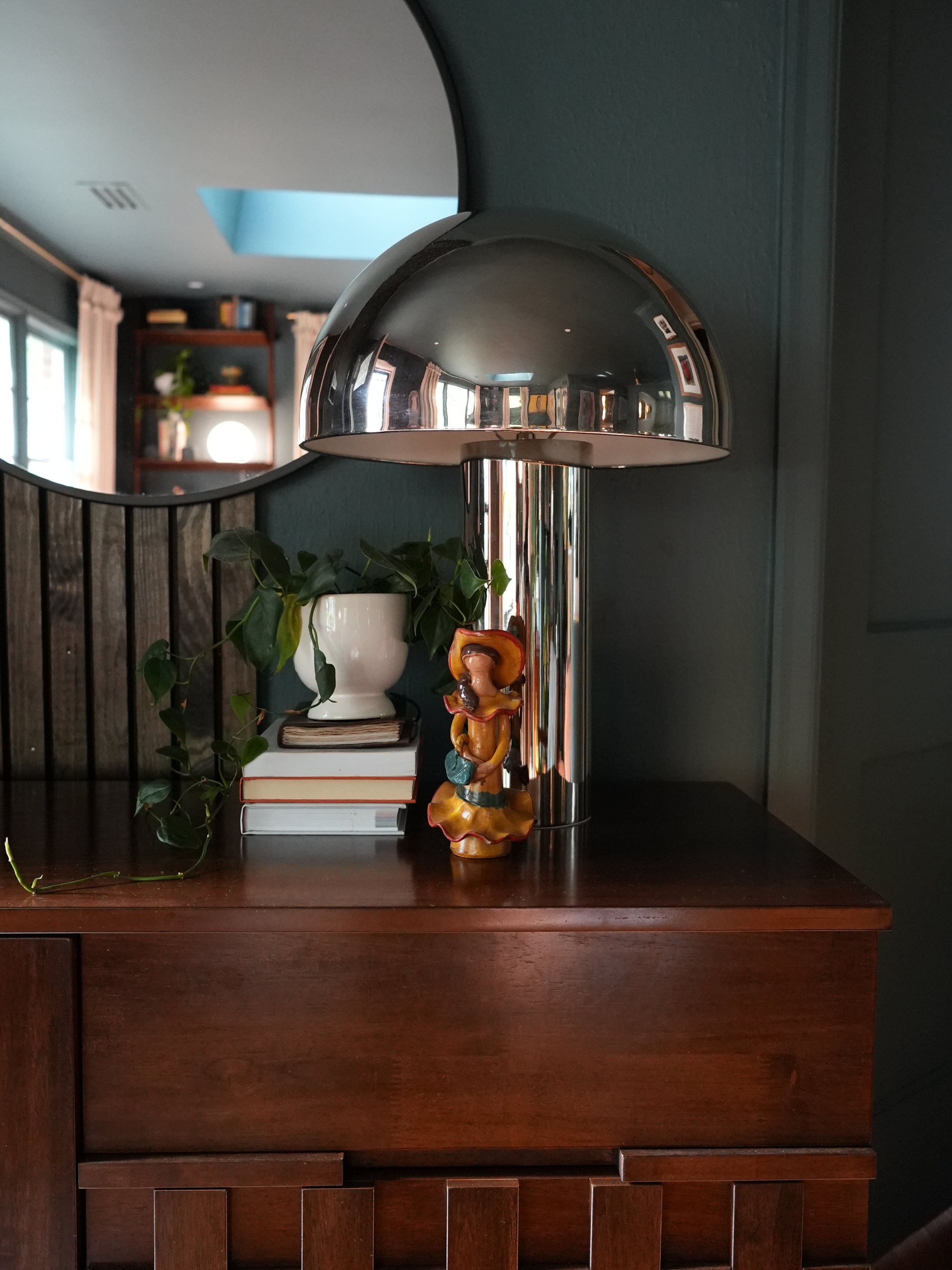
Shown here: Sin Cara doll from Dominican Republic. Upon entering my home, this is a celebratory nod to my heritage.
Brass has and will always have my heart! But, its something about this nostalgic wave of chrome coming into interiors that has my soul divided! In such a warm space, I love how the chrome balances out the aesthetic and feel. As its shiny and cool metal sits atop a brutalist-inspired, walnut cabinet I use to store guests’ shoes and shoe covers, it creates the perfect balance to capture my ambivert (intro/extrovert) personality; believe it or not, I like to retreat as much as I love to be a social butterfly! Too, I adore mixing fine and rough materials for my clients. So, why not do so in my home, too?

Another more refined material I love to use and wanted to bring into my home is marble! This is the Mya Side Table in Rosa by Nuevo. When I saw this accent table, I immediately fell in love! It’s the perfect place to display flowers in a space too small for a coffee table. And although it may not be the intended use for the table, I found it to be a useful and convenient place for my books. Of course, its also the ideal landing spot for my glass of champagne as I curl up in the corner of the sofa to read.
I chose this color because I feel it captures the duality of my personality. I’m as serious as marble is hard when I need to be. But overall, I’m all love and light like the color pink!

I also decided to replace my more boho-chic media console from before with this golden-textured, solid wood console from CB2 (not sponsored). Knowing that my living room welcomes the day by receiving the sunrises, I decided on this gold leaf-like material so that it can reflect the warmth of the sun all morning long!
Other than it’s grand appearance, this console has got some serious storage! Now organized, it houses all of my content creation equipment, chargers, batteries, as well as board games, living room candles, and even my Nintendo NES - y’all, I love old video games despite not having much time for them now. We’re working on that, though!
Now, time to debunk a myth.
Dark Colors Make a Space Feel and Look Smaller
False . . . completely.

Although creating a more intimate feel, color drenching a room in a darker color doesn’t make the space feel like a lasting hug that you wished would end!
Rather, it creates a feel and look of infinite space; in both day and nighttime. It helps blur the lines of where one plane ends and where another begins. So, although I, too, feared the effect of color drenching my living room in this darker blue, I couldn’t love the result more!
Hot tip: try choosing a color with warm undertones so that, like in the case of the Inchyra Blue here, the sun picks up on them and amplifies them during daylight; therefore making your space feel more open and joy-inducing.
Are You Inspired?

Photo: Andrew Puccio
And not necessarily by my living room, rather the reason I decided to redesign it! As we continue to grow into who we are as individuals, our taste and preferences tend to follow that same pattern of change. And as we beautifully evolve, so can our homes as an extension of representing who we’ve become.
As a designer, I’m interested in creating spaces that can be lived in beautifully, rather than simply feel designed. And one thing I love to encourage is making sure the spaces we live in represent us . . . wholly.
So as you can, don’t be afraid to allow your home’s style and design evolve with who you are becoming. That’s the beauty of remembering this key factor:
We never graduate from making our houses our homes, for they can always be edited as we beautifully continue to grow into ourselves through love.

Photo: Andrew Puccio
And if y’all thought I’d complete this space without the presence of disco balls, do we really know each other?!
Sources + Costs
Isla Sofa | Lilou Ottoman | Mya (Marble) Side Table | Star Side Tables - Nuevo (Gifted) Furniture Sponsor
Nerissa Rug - Ruggable (Gifted + Partnered)
Paint: Inchyra Blue | Dead Flat Finish- Farrow&Ball (Gifted)
Velvet Ball Pillows in Olive Green - Wideas Home (Purchased)
Soto Chair in Plush Mist - Joybird (Purchased)
Nabla Bookshelf and Kenzie Media Console - CB2 (Purchased)
Cotra Chrome Lamp - Lowe’s (Gifted)
Brutalist-Inspired Console Table - Wayfair (Purchased)
Nesso-Replica Lamp - Amazon (Purchased)
Fado (Orb) Lamp - Ikea ((Purchased))
Pieced Stripe Curtains (96x50) | Green and Yellow Hombre Disco Balls- Anthropologie (Purchased)
Skylight - Velux (Gifted)
Pesse Olive Planter - Article (Purchased)
Costs
Other than the costs of the bought furnishings, there were some associated costs for the labor - including installing some of the gifted items. Here’s a breakdown to keep in mind for your home projects.
Painting + Removing Popcorn Ceilings | Smoothing Out Ceiling Sheetrock: $2,400 - this was in conjuction with painting and removing the popcorn in my dining room as well.
Skylight Installation: $2,500 - this was along with the installation of the skylight in my kitchen, too.
Electrical for Puck Lights: $750
Mounting Frame T: $100
Assembling the Entryway Sideboard: $250
Furnishings Purchased: $4,268
Grand total: $10, 268
Again, these figures are shared to help you plan for future projects, or hiring a designer . . . Like my team!

