Cocina IV: A Space Inspired by Love and Light
Although many say that the kitchen is the heart of the home, I like to think that the dining room is the real heart. After all, that’s where we break bread with those we love and want to continue cultivating relationships. However, I do feel that the kitchen is what breathes life into a home; the lungs even of each one of our abodes! I must mention that this is the first renovation I’ve taken on as a homeowner. And although scary at times, I couldn’t be more in love with the result and excited to finally share with you the soul poured into Cocina IV!
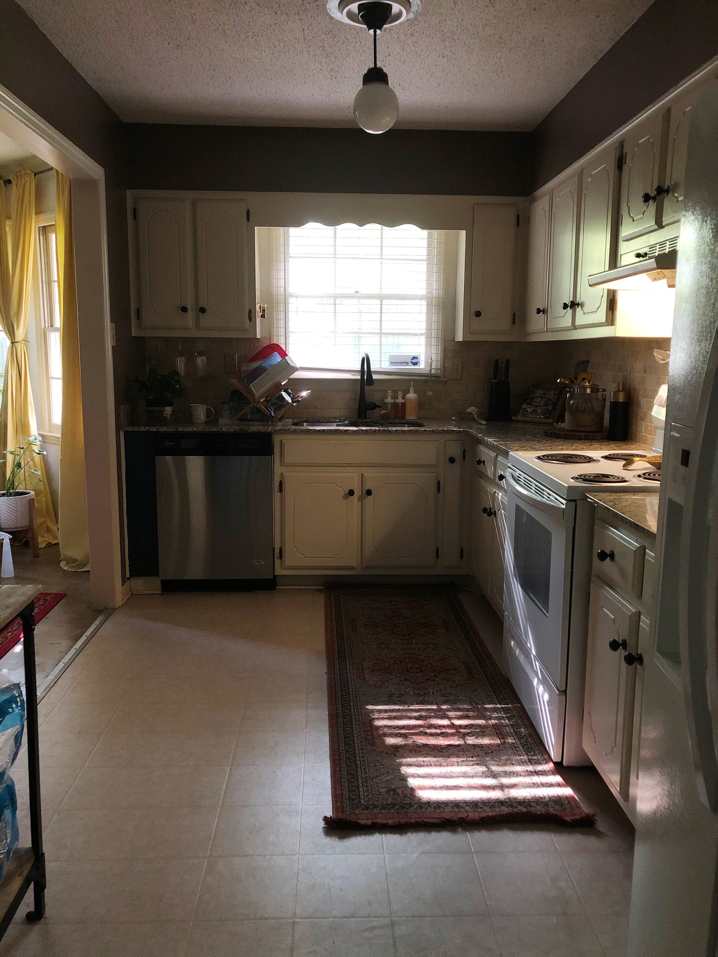
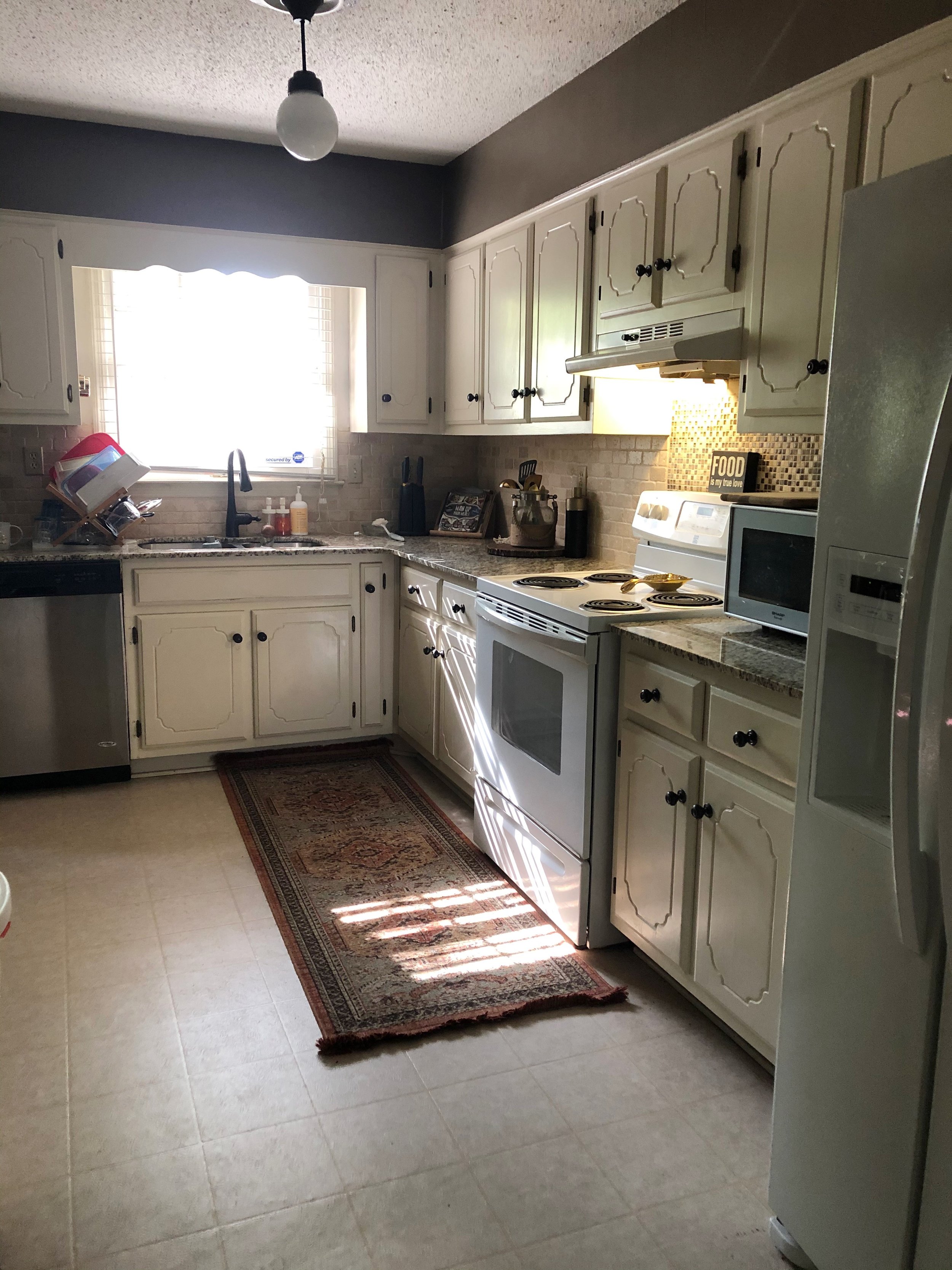
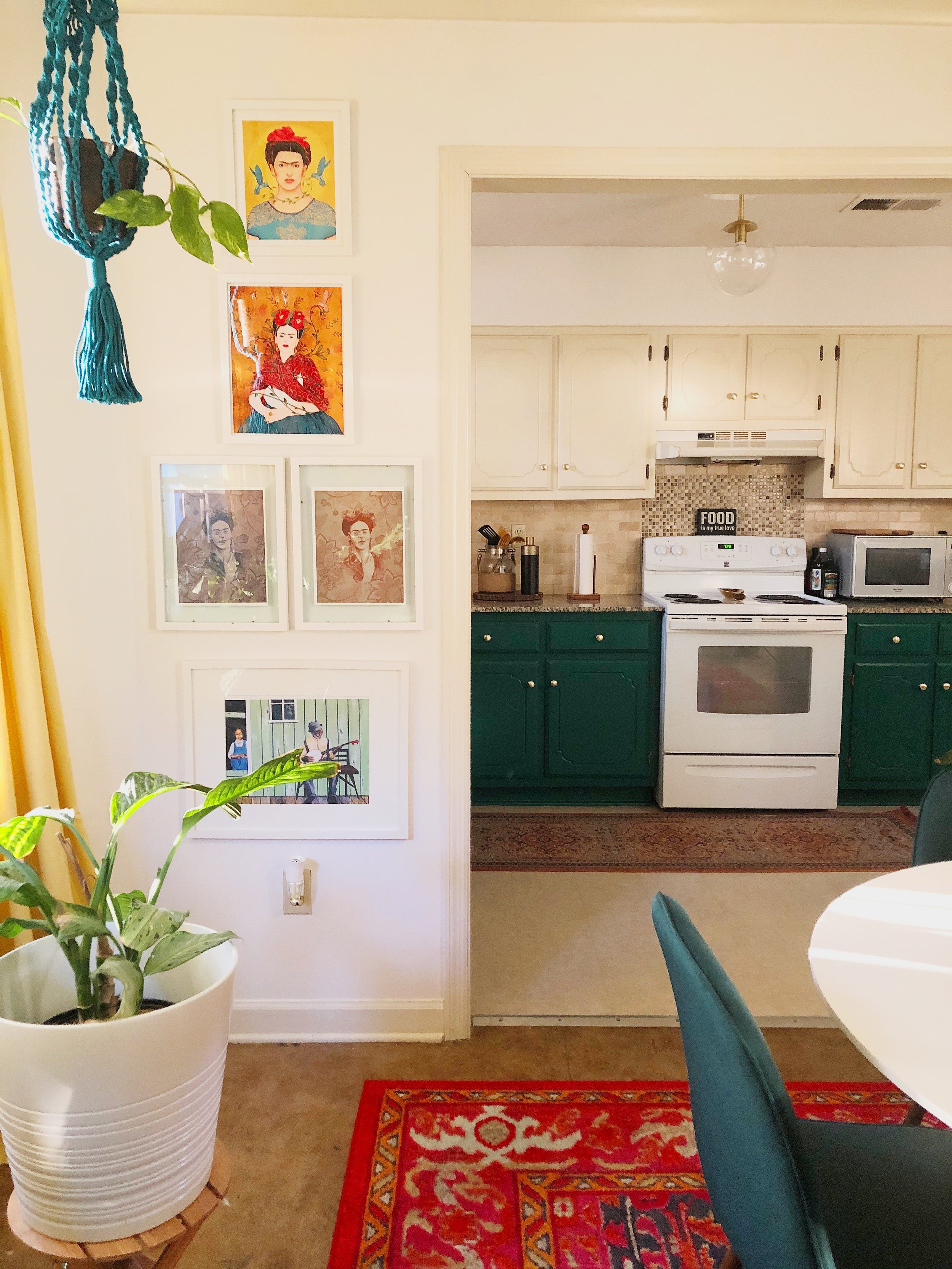
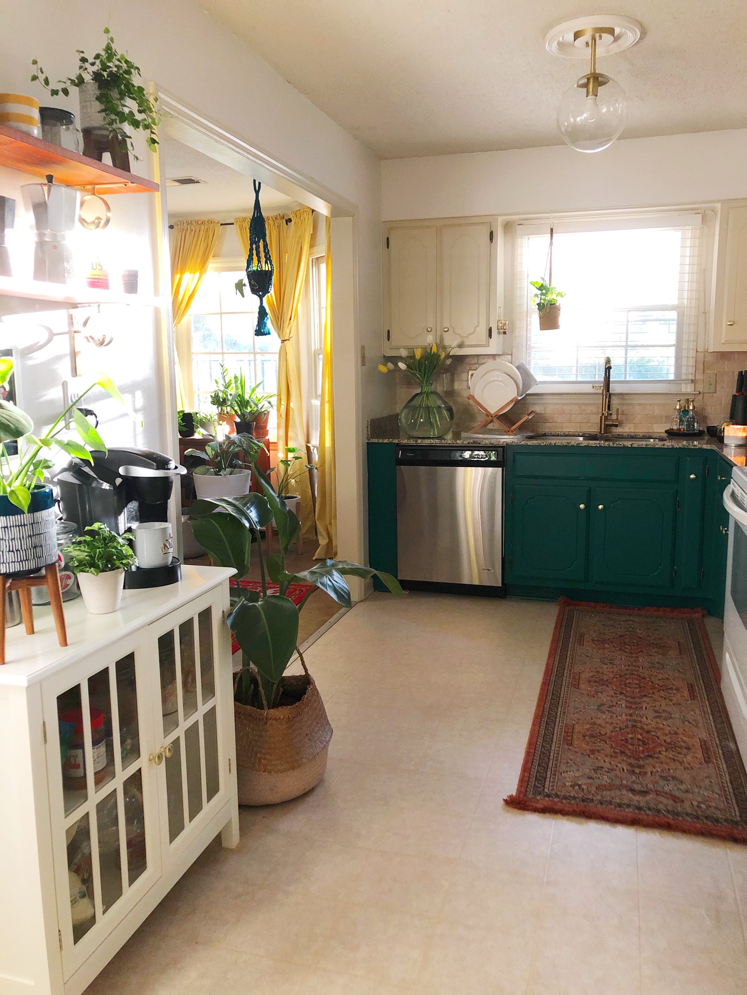
But for now, let’s rewind back to how the kitchen looked when I first moved into my home 6 years ago, and how it looked after a refresh I did during, well, the “panorama”
Out with the Old
When I first saw my home’s kitchen, I began to imagine the potential it had! The window at the end of the one-wall kitchen - for me - symbolized the hope of a space that would one day reflect the vision I had for it, and more importantly, reflect ME!
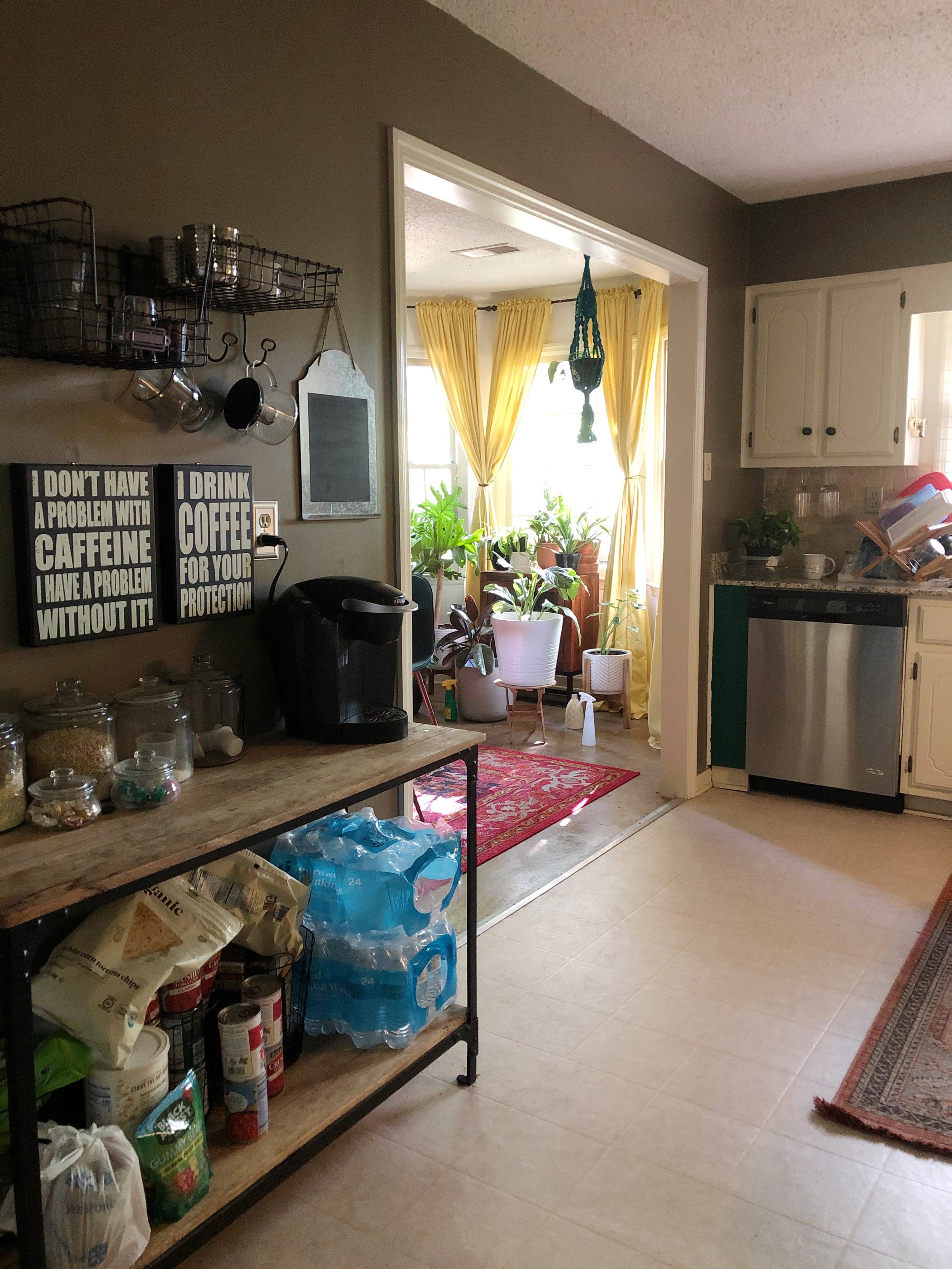
In this space existed two major problems: how dark and “meh” it was and the lack of functional* storage. As someone who deals with SAD (Seasonal Affective Disorder), the original kitchen’s design oftentimes felt like a dark hole in my home. In the mornings, I never felt that spark of joy one would hope to experience as they go into the kitchen to make their coffee to begin the day. Also, cooking is something I LOVE to do! But if I’m not inspired by my surroundings, I feel like the food just doesn’t taste as beautiful as it could taste. Besides how uninspiringly dated the space felt, with the lack of a pantry - my hot water tank lives where the pantry once was - storage for snacks, canned goods, and other food stuffs fell somewhere between awkward and nonexistent.
With just quitting my corporate job and, during the “panera” unexpectedly falling into becoming a content creator, I needed a space to inspired me to do just that - CREATE! However, a full kitchen renovation just wasn’t in the budget at the time. And with us being at the height of quarantine, any updating to be done would have to be done by me. So, I decided to try my hand at giving the kitchen a refresh!
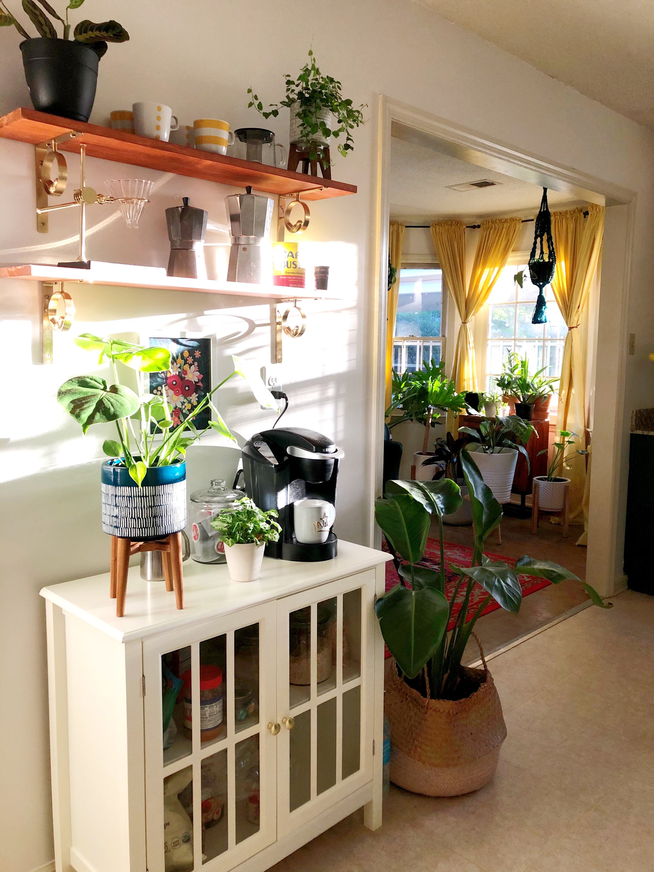
Sometimes a little paint goes a long way! By painting the walls white and adding a splash of color to the lower cabinets, the kitchen finally reflected that Sense of Happy I desired to feel when sauntering in for my morning cup of Bustelo! Too, I made small but impactful changes, like switching out the cabinet knobs, the faucet, and light fixtures, as well as, removing the wooden window valance to give my kitchen an updated appearance. And to solve my storage problem, I added shelves to the (north) wall and brought in a shallow cabinet to house all of my beloved snacks! This also became my coffee station, using the shelves above to showcase ever-growing collection of mugs.
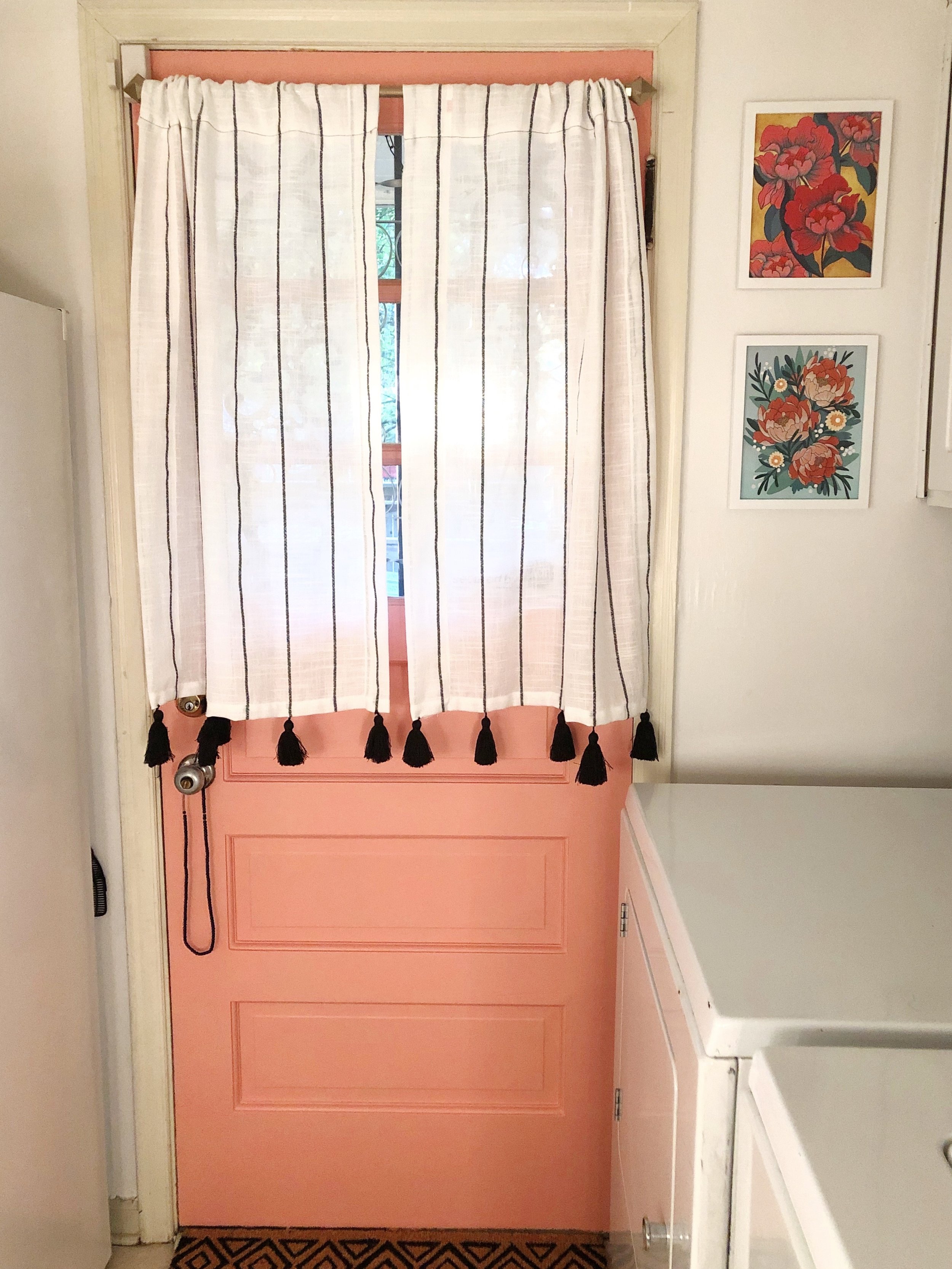
Y’all, I was proud of my kitchen refresh! I worked hard on it! I even made cafe curtains for my newly salmon-painted side door! And to be honest, the changes mentioned above are a GREAT way to effectively update your kitchen, bathroom, or any other space that needs new life breathed into it without breaking the bank!
Although I loved this kitchen for it’s cheerfulness and how it encouraged me to create - and let’s not forget the many mocktail and food videos that were filmed here - it still never really felt like ME or how I envisioned the kitchen of my and my home’s dreams.
So, it was time to start leaning into my imagination and planning a kitchen that would warm my spirit each and every time I walked in!
A Space Reimagined: The Inspiration
Since I live in a 1953, mid-century modern ranch, I wanted to make sure that any change that I made to my kitchen would be more restorative, really capturing the spirit of my favorite design era. However, I wanted to do so in a way that describes my home’s overall aesthetic: someone of African, French, and Spanish descent who loves the naturally influenced mid-century modern homes of southern California, but just happens to live in Cote d'Ivoire . . . I know, it’s a lot. But it PERFECTLY describes my personal design style.
Initial Kitchen Concept Rendering
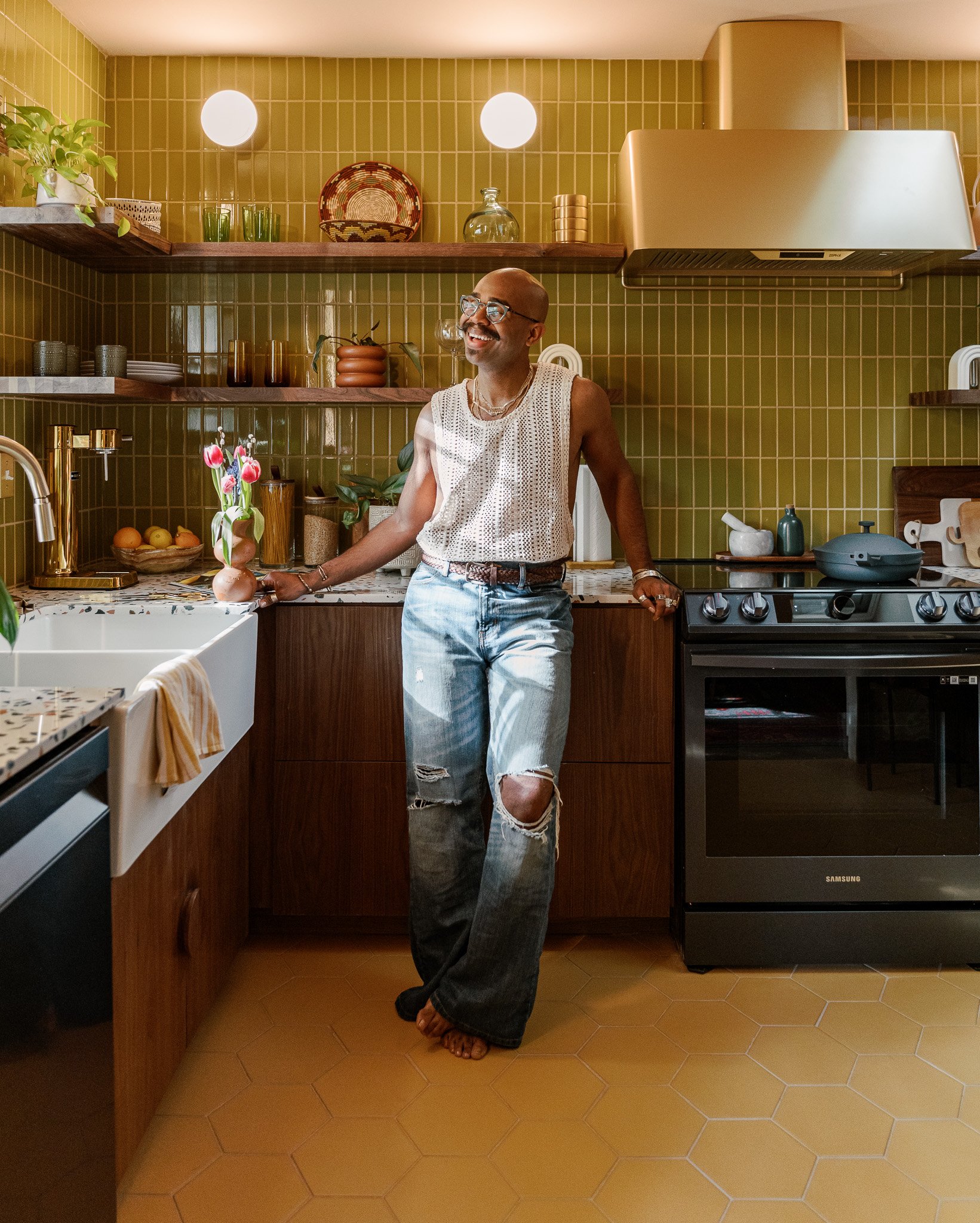
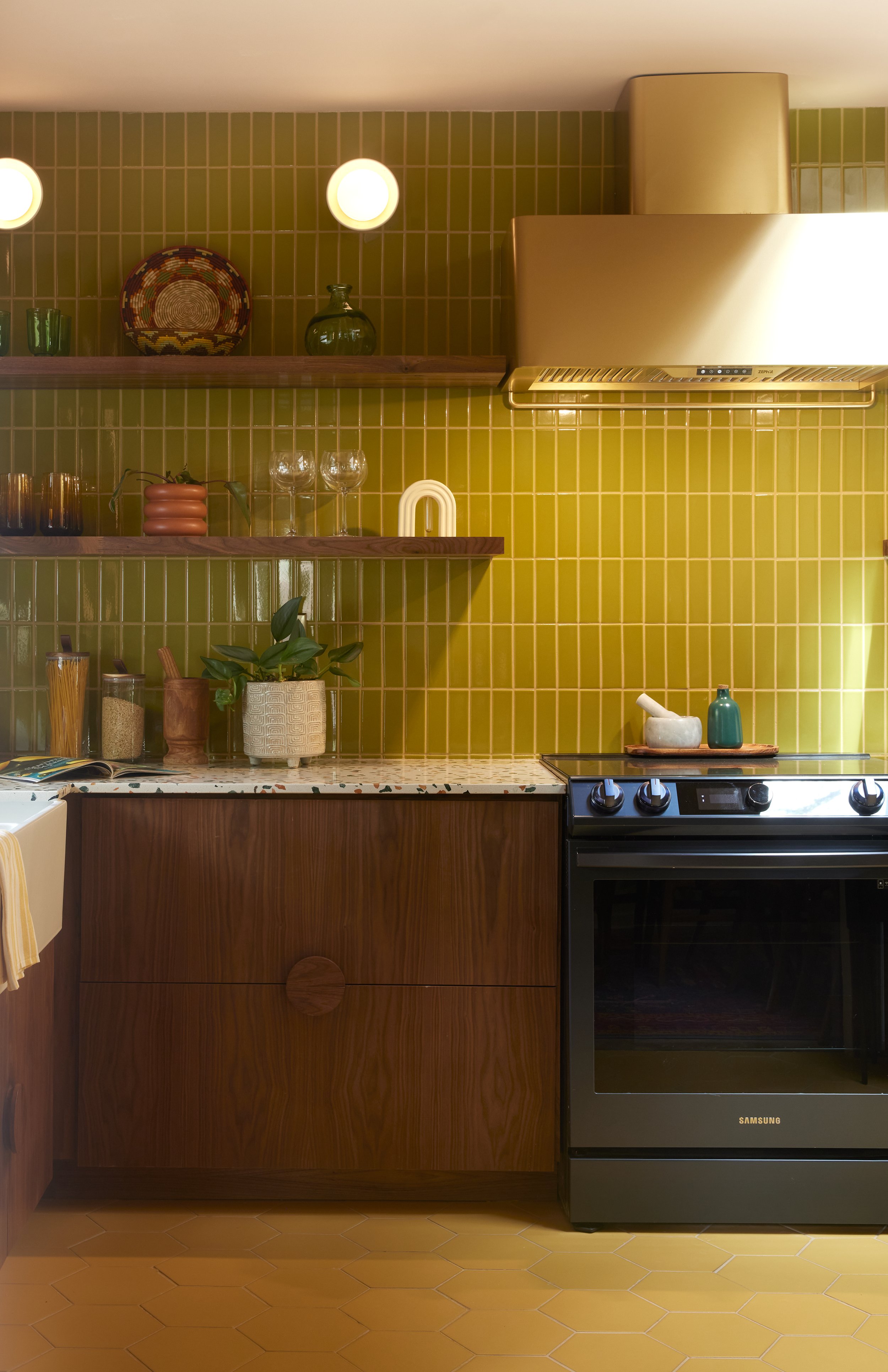
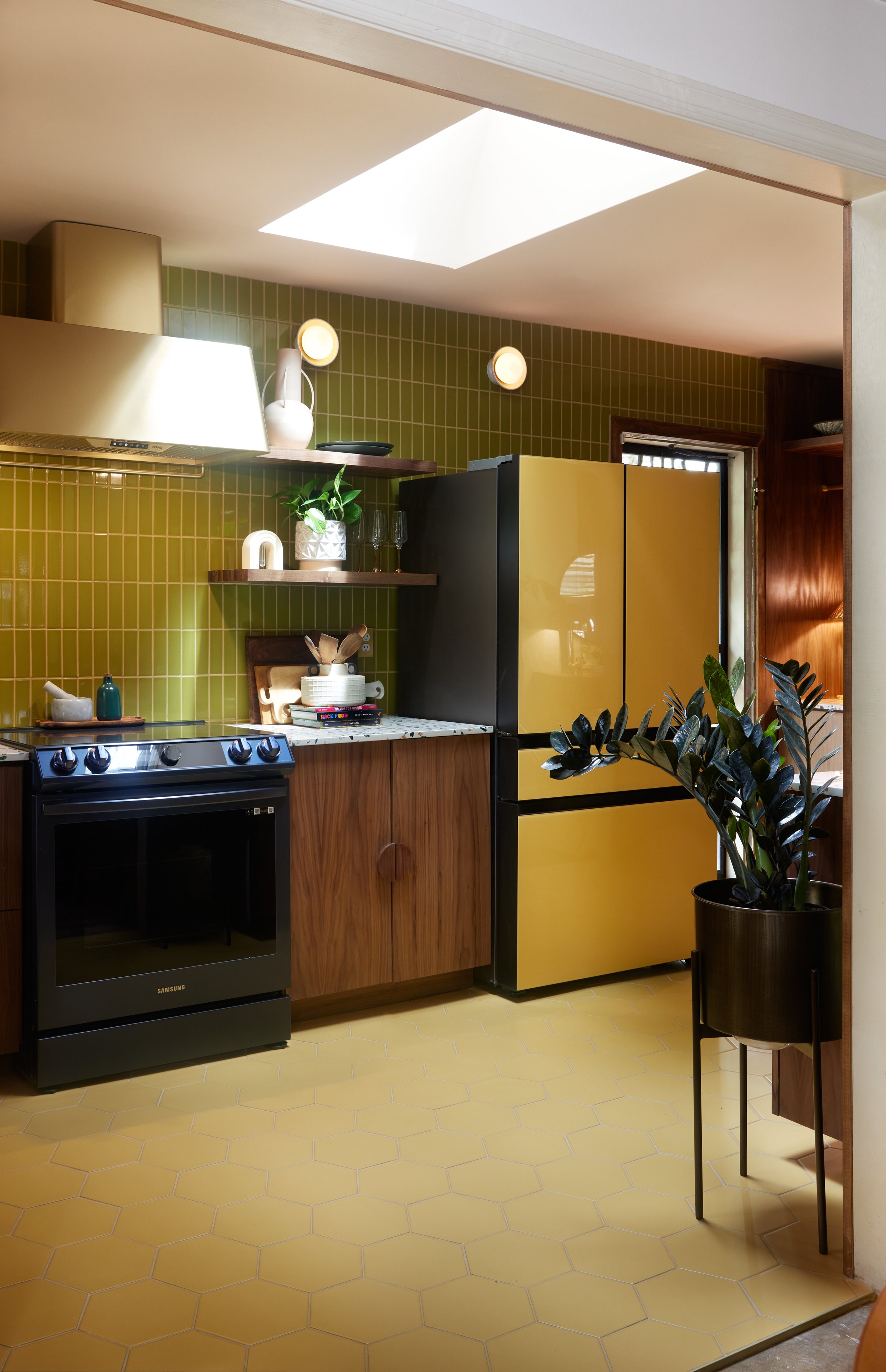
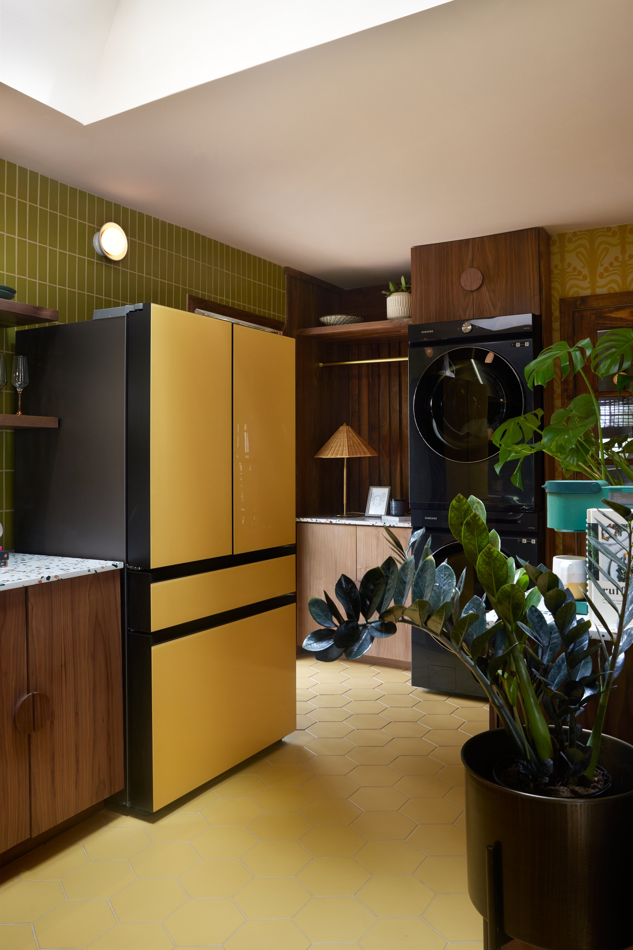
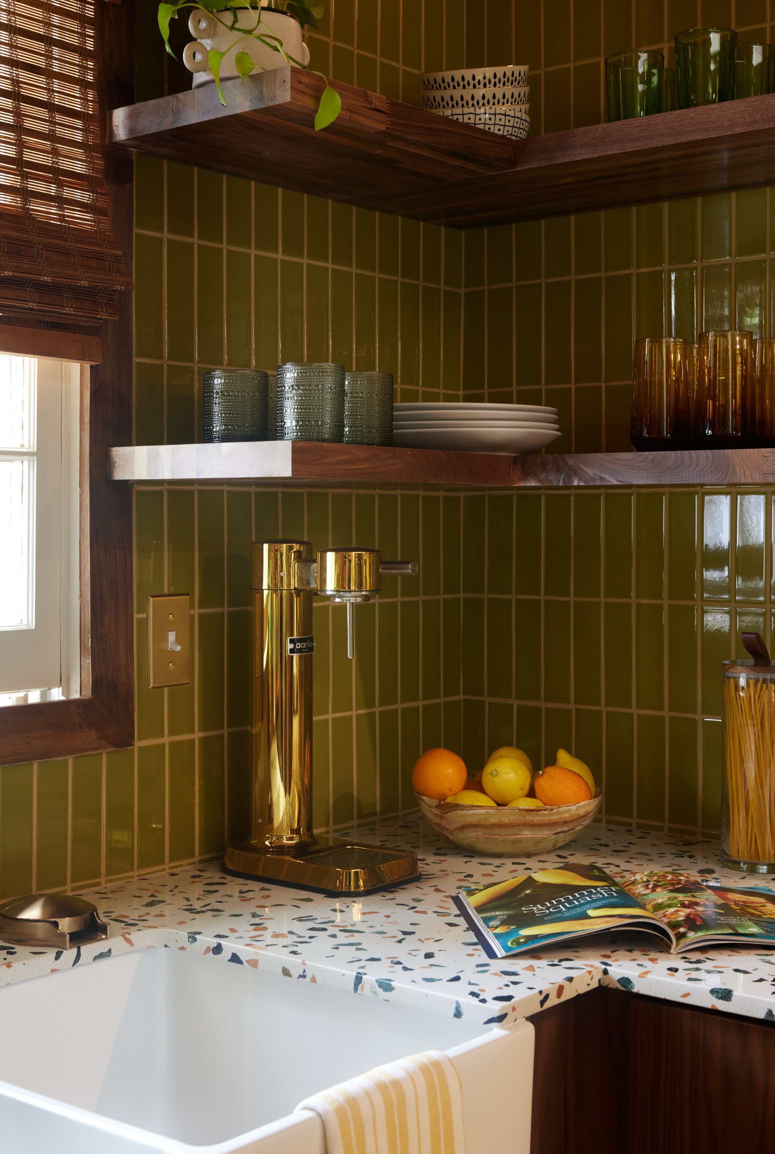
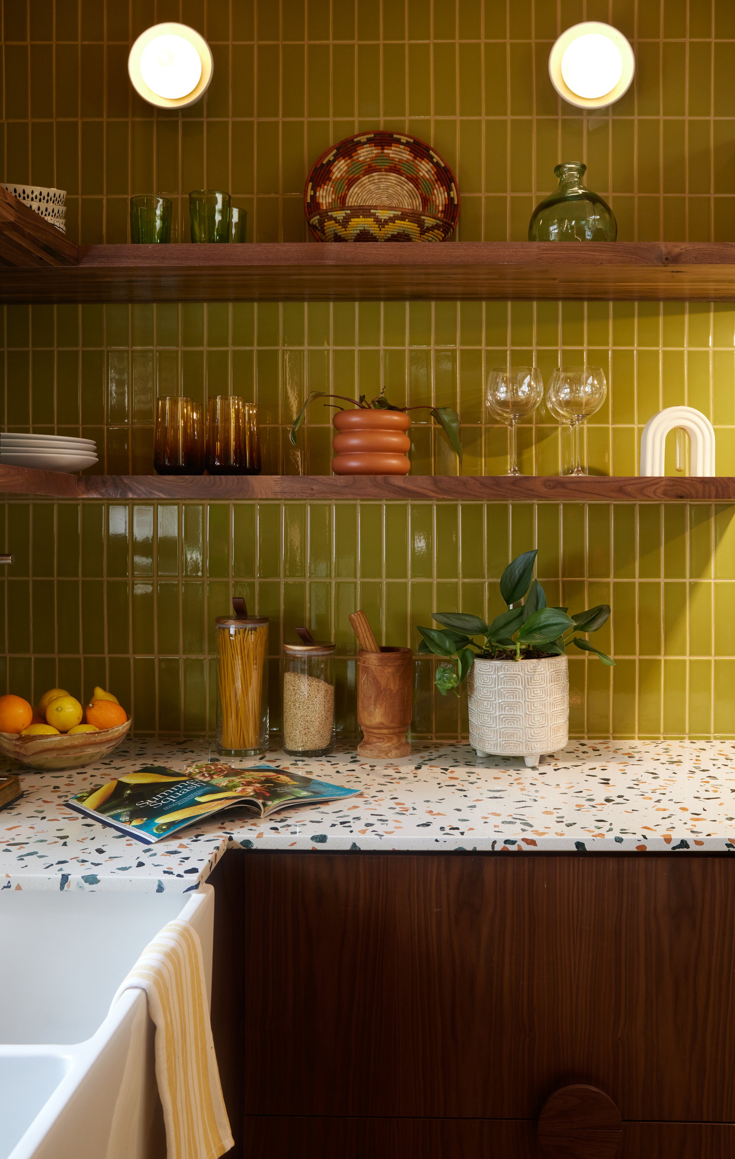
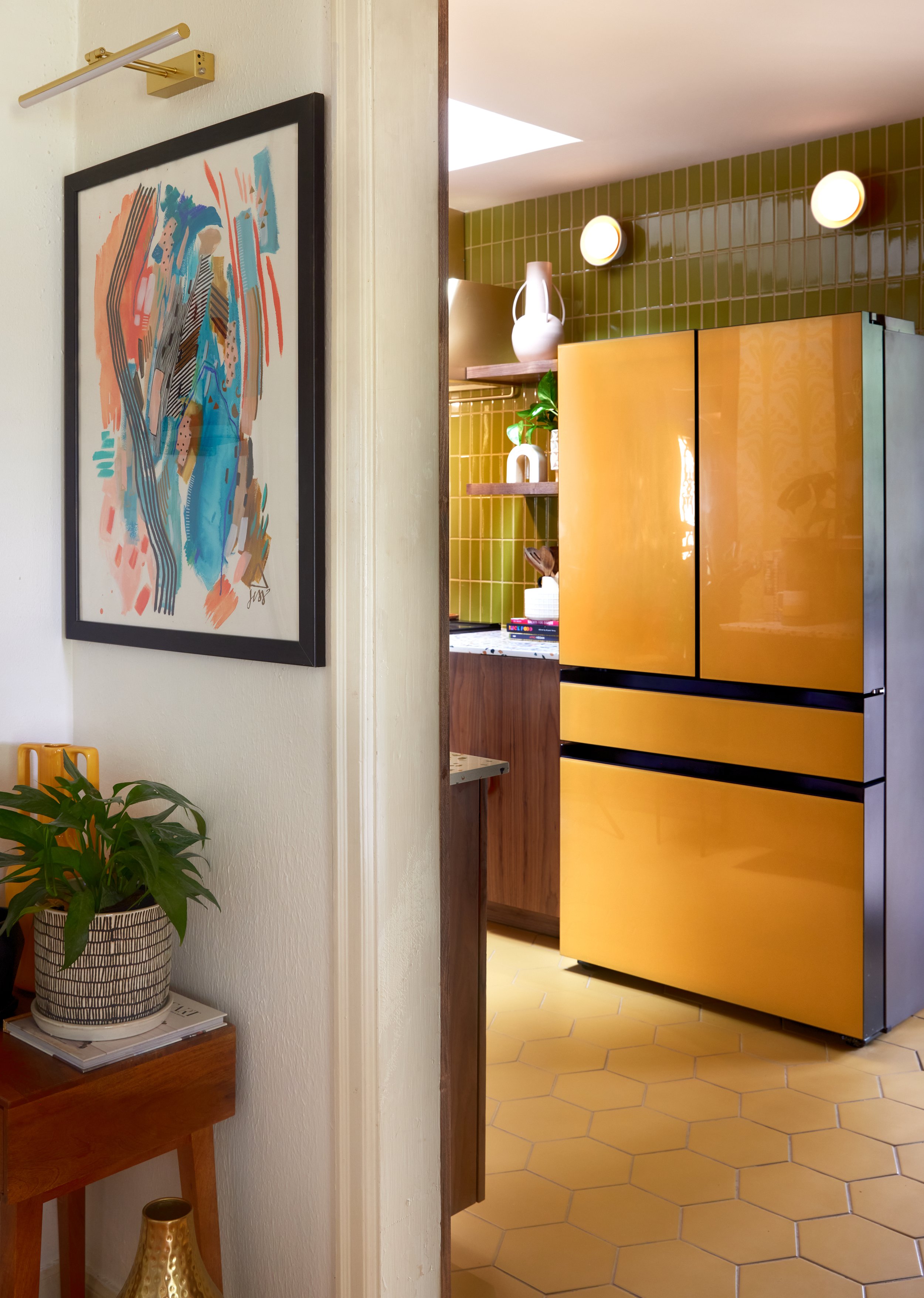
Going back to the window at the end of my kitchen, the view of my backyard during the spring and summer months . . . that was my color inspiration! From the initial concept rendering, the green tile represents the greenery from the grass and flower bushes in my backyard. And since the warmer months are my favorite, it’s easy to reason that the yellow of the floors and fridge represent the sun and its warmth! Because brass is my favorite metal to use - and its materiality communicates warmth and joy - my fixtures naturally would have to be brass.
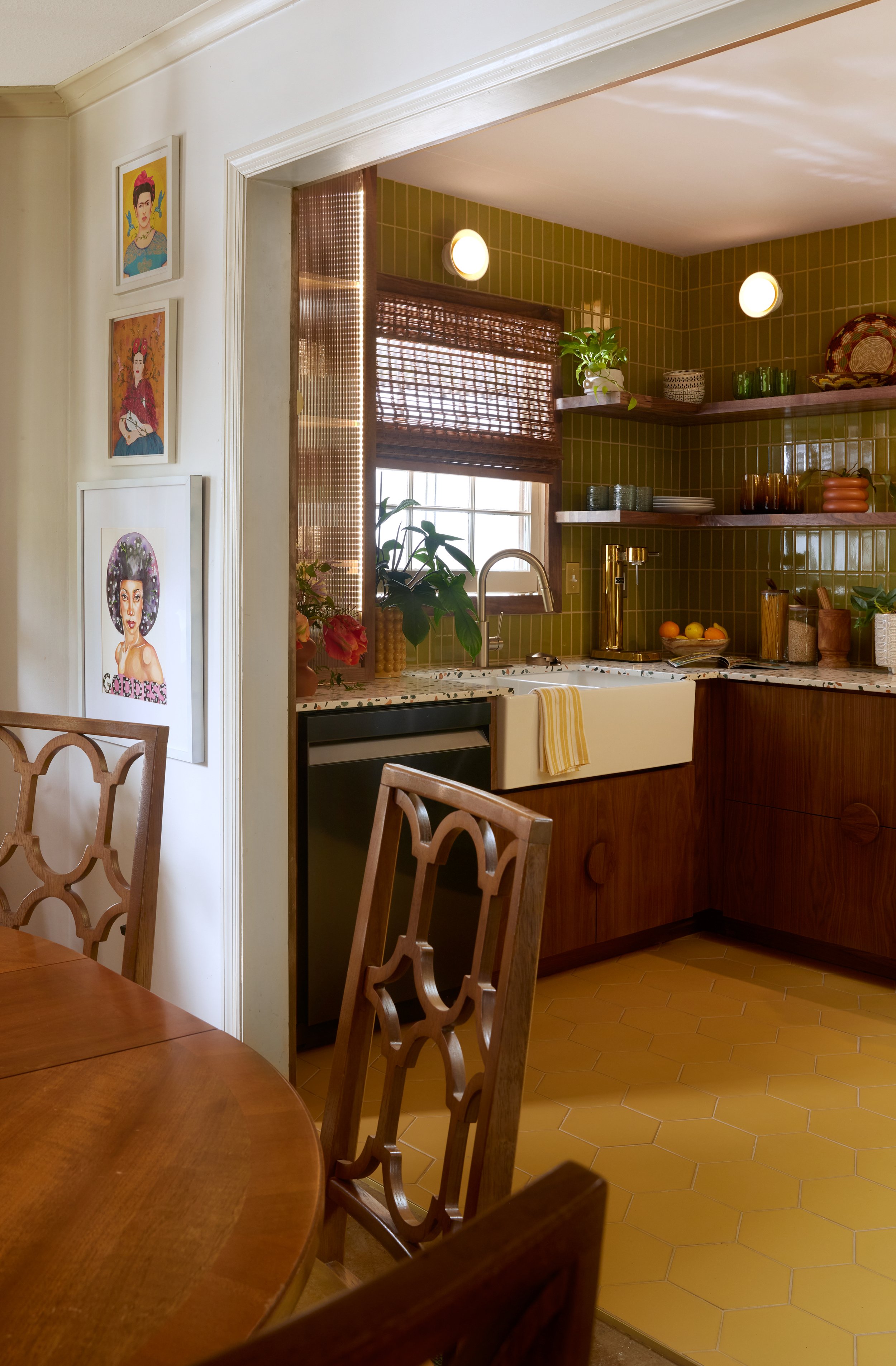
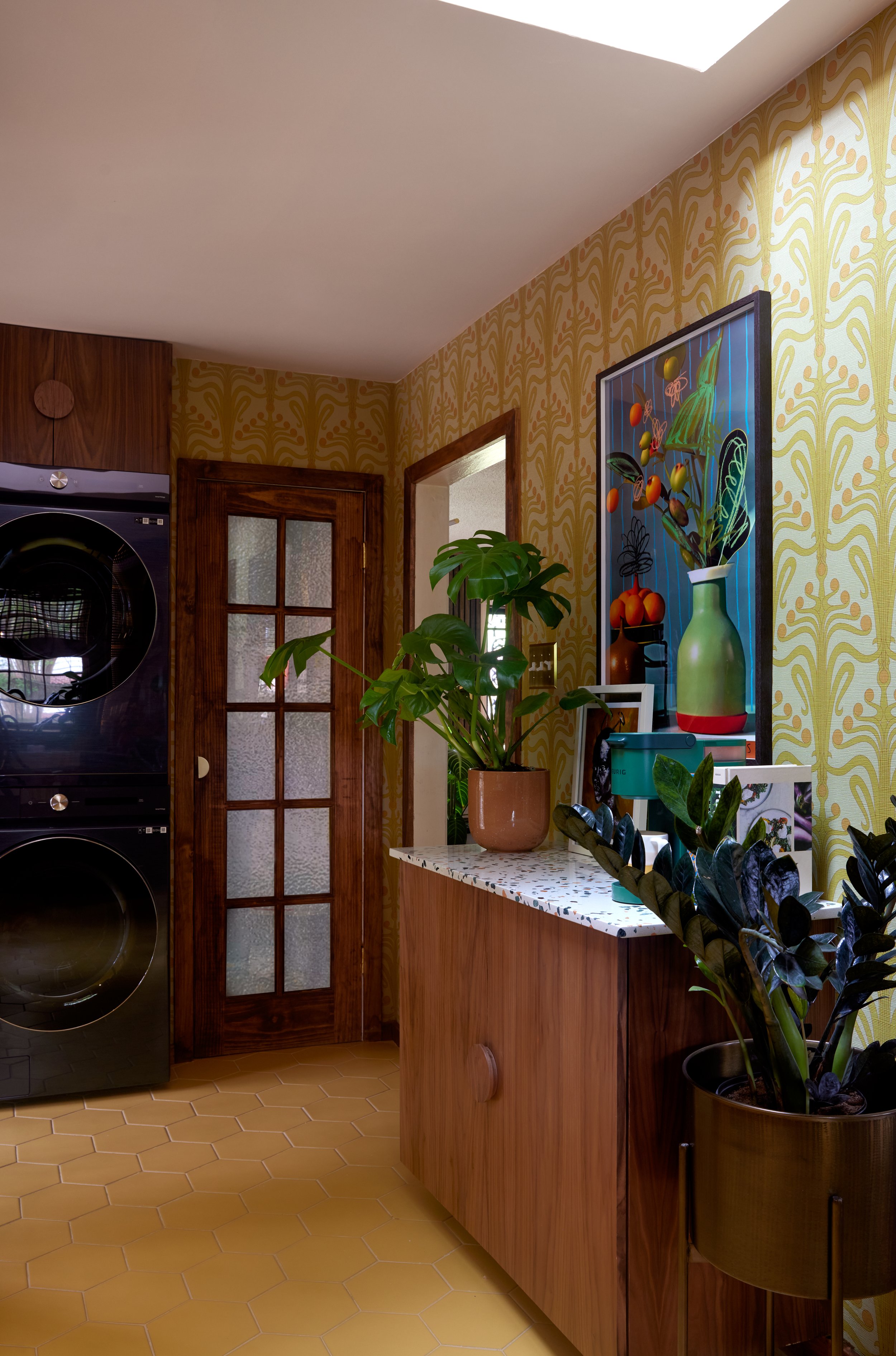
To stay true to the mid-century modern roots of this space and my home, I opted for terrazzo countertops, completely tiled walls, (eventually) diffused-light wall sconces, and walnut cabinets. During the dream phase of this project, I didn’t know that I would end up with custom cabinets made by a local fabricator, and now friend. And because most of my favorite MCM (mid-century modern) homes have abundant light pouring in from all angles of a space, I planned to install a skylight! This way, the kitchen would capture the daytime stroll of the sun from above, the golden hour from the window at the end, and at night, the position of the skylight sits right under the moon’s path. MCM for me was all about letting the outdoors in, and if I could involve more light and the moon - my favorite celestial body - in any space I design, I’m gonna do it!
As I ask of my clients, I asked myself: What song sums up the design inspiration for Cocina IV? Montara by Bobby Hutcherson is how this kitchen would feel!
I didn’t know that brass would be incorporated in a larger way a little down the road! So now, it was time to get to work on bringing this design to life . . . but not without a few pivots, of course!
Demolition Time: With problem-solving in mind!
To address the spatial issues - because I like to create spaces that encourage imaginative stimulation and breathing a sigh of “this feels like home”, here are the four major structural changes we made:
Removed the upper cabinets: To be honest, the cabinets above my stove before could only store one bottle of olive oil. Because the old vent hood’s mechanics were housed there, not much storage was available. Looking at what I was storing vs what storage I actually needed for my lifestyle, I made the decision to completely eliminate the upper cabinets. This move alone visually opened up the kitchen!
Removed the bulkhead: To further increase the visual space from the ceiling down in the kitchen, I proposed that we remove the bulkhead. This would allow the eye to travel all the way up to the ceiling. Thankfully the electrical nor air ducts were hiding behind the bulkhead - only. a squirrel that had found its eternal resting place. So that meant this structural change could be made! And with the proposed vertical wall tile, the room would naturally appear taller!
Installed a skylight: Thanks to the generosity of my friends at Velux, we were able to install skylights in the kitchen. Since the kitchen would remain dark until golden hour, I wanted to find a way to let in another facet of natural light. And since the ceiling would have to be vaulted in the area of the skylight, this would again increase the visual space in my kitchen! More natural light AND space? A win-win!
Renderings by: Kristin Owen of Humbled Kreations, LLC
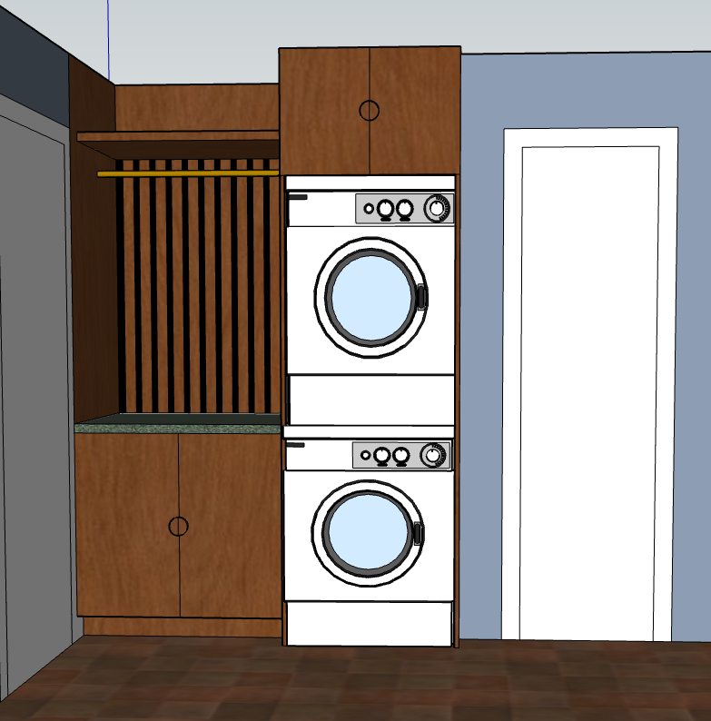
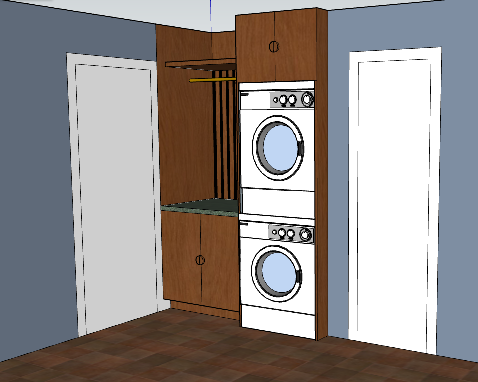
An intentional laundry area: Lastly, and since my laundry area was set up as a side-by-side washer/dryer situation right next to my sideyard door - you can see it a bit in the photo below - the space wasn’t being used to it’s best potential, and the door could never open all the way since it was being partially blocked by the dryer. I designed a more effective laundry area using a stackable washer and dryer, and pushed back the cabinet a bit so that my sideyard door could open freely. Too, along with Kristin’s - owner and cabinet fabricator of Humbled Kreations, LLC - expertise, we managed to create even more storage space in the same corner of my kitchen!
A Major Pivot: But not without great solution!
Wall and floor tile: Fireclay. Countertop: Santamargherita: Palladio Fenice, courtesy of Countertops of Memphis
At the beginning of my planning for the kitchen reno, I’d fallen in love with the color combination above! The glossy Palm Tree wall tile and the matte Sunflower yellow floors from Fireclay, combined with the eclectic green, pink and peach terrazzo found at the local Countertops of Memphis was what my heart most desired and I’d made sure to save up for those specific countertops! However, a month before the renovation would commence, I was told that the green marble terrazzo was no longer available because it was lost at sea!
For a little moment, I had to sit with the fact that the countertops with which I’d fallen in love were no longer an option. Y’all when I tell you I LOVED that terrazzo. But, that sadness turned into action because at this point we were less than a month out from the renovation and we had to make a decision - fast. What we came up with together was even better than before!
The Kitchen of My Dreams!
Photography by: Sarah Rossi
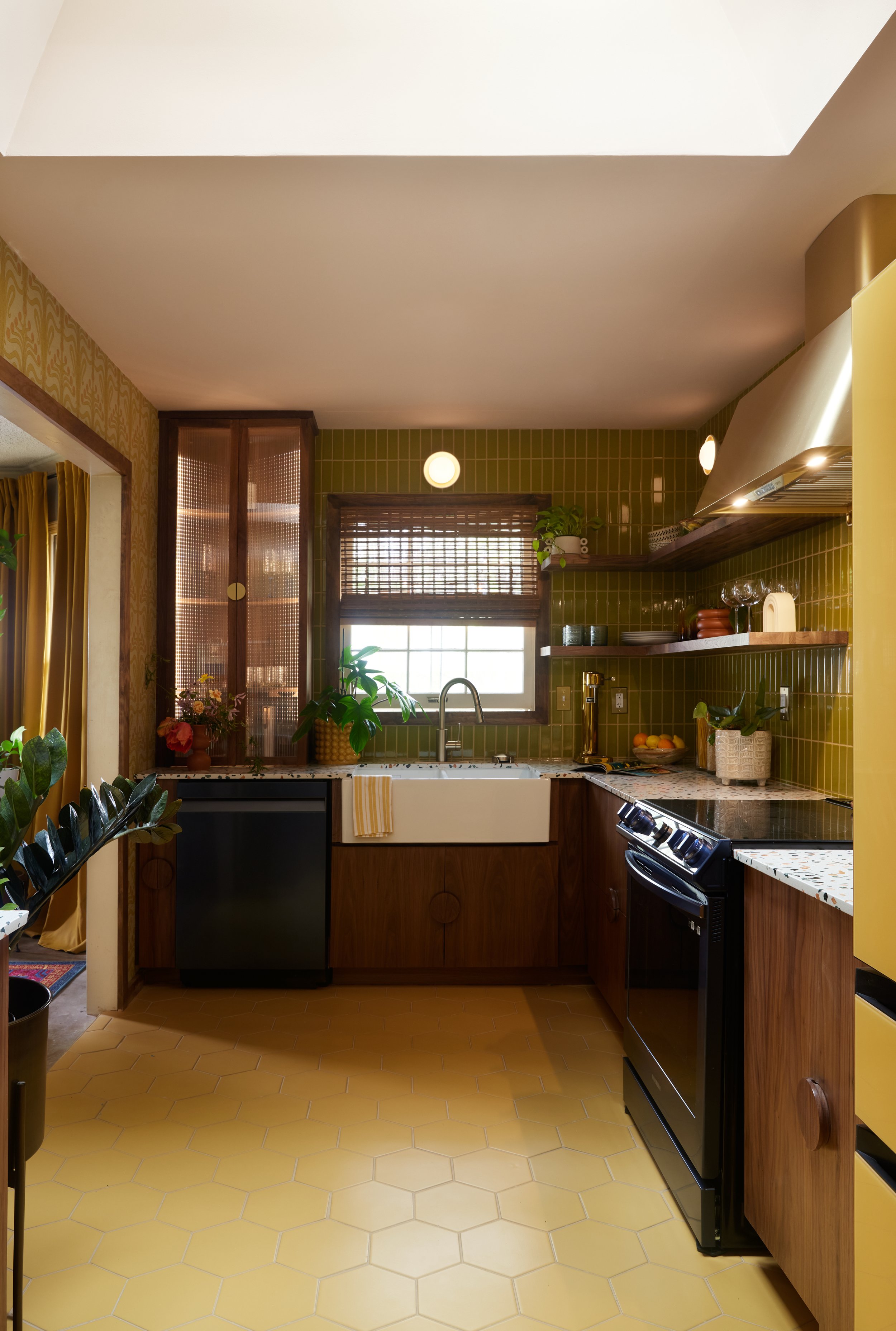
Photography by: Sarah Rossi
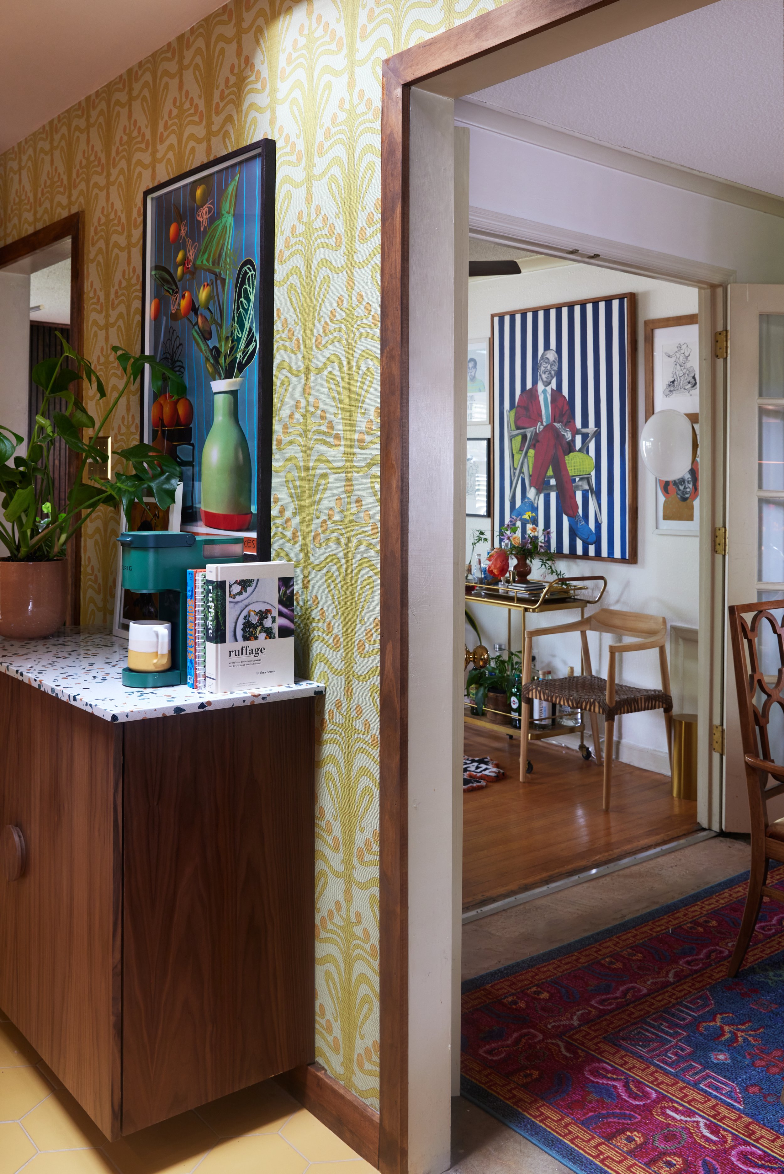
Y’all! Through all of the pivots, shuffling through the labyrinths of small appliances and snacks in my home from living here during the renovation - we’ll speak more on that later - and the late nights, and early mornings . . . it was worth it! The kitchen of my dreams finally met my reality, and my heart couldn’t be more full!
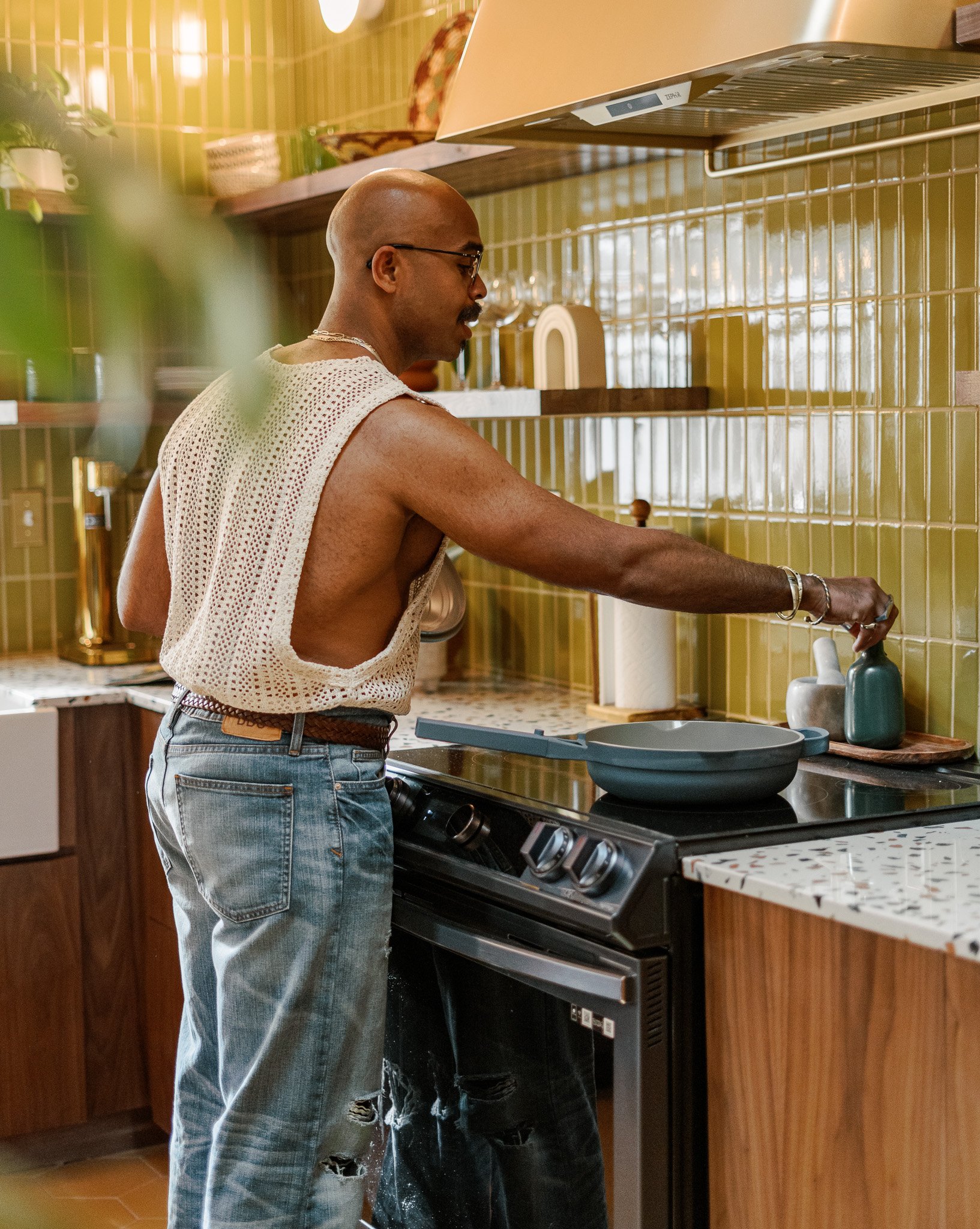
As a designer who starts with function, then dives into form, I love how this kitchen now meets all of my spatial and storage needs while being one of the most accurate representations of me as a person. Too, as a content creator, I now have one beautiful backdrop for creating my cooking and - yes - cocktail and mocktail videos! I just wrapped up a video now, and I can’t get over how gorgeous the kitchen looks in video!
Now, let’s get into some of my favorite features of Cocina IV!
It’s the Little Things: The Details
The Vent Hood
I originally saw this vent hood on a friend’s stories this past summer. You know I had a fit because brass is my THING! I saved it as a dream piece for my kitchen, but never really considered it a reality. I added it to my vision board just in case. The same month we started the renovation, the brand reached out, offering to gift me the vent hood! Since this kitchen is inspired by love and light, with its golden glow as the light hits it, I view the vent hood as the kitchen’s sun! I’m still in shock over their generosity! Zephyr, thank you SO much!
My Custom Spirits and Glass Cabinet
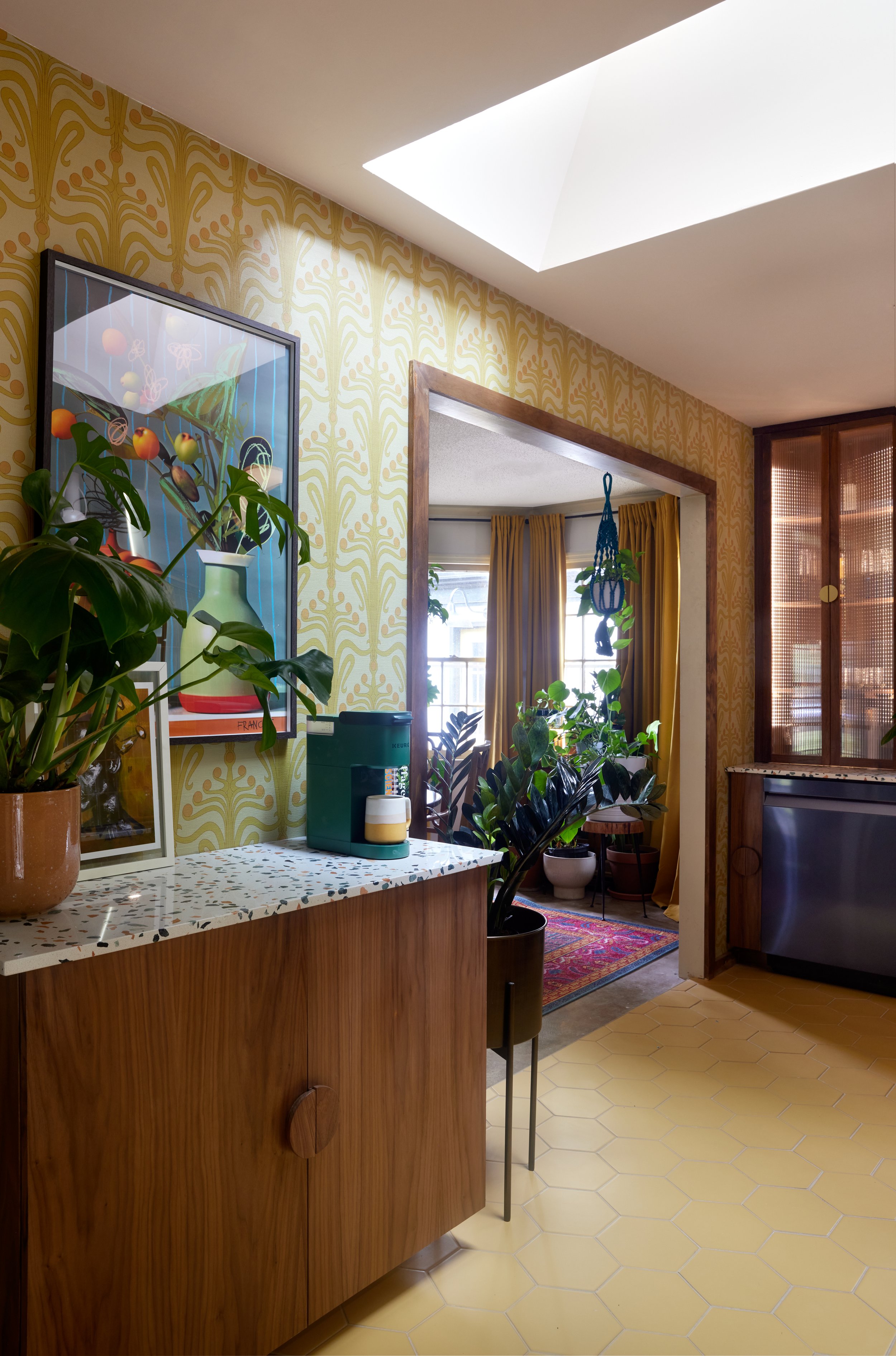
Since I was little, I always loved the sound of the doors closing on my mother’s and grandmother’s dinnerware cabinets; how the glass looked inside and represented a place to keep the “good stuff”! As this is my forever house in the making, I wanted to make sure I had a space to keep my “good stuff”. So, I designed this cabinet to house all of my finer spirits and glasses. Built by Kristin and Dustin, with custom lighting by The Pros Contracting, the execution of this cabinet far exceeded my expectations and napkin drawings! And the brass handles eco the same design as the rest of the kitchen’s cabinetry.
Cabinet Pantry
I get tons of design inspiration while traveling! Knowing that I had this kitchen renovation coming up soon, during my last visits to New York, I studied the kitchens of a couple of friends: small space-living with big style is definitely the NYC vibe! Since my kitchen is relatively small in size and storage, I wanted to make every square inch of the cabinets count. With no pantry in the space, I decided to concept a cabinet pantry. Each shelf is wide and deep enough to store all of my spices, snacks, and canned goods. Again here, Kristin and Dustin saw my vision and upgraded it by 100x! And on the other side, slide-out drawers to store all of my small appliances and pots!
A Laundry Station: Finally!
Earlier in the blog, you saw how the previous washer/dryer setup blocked my side door. What didn’t show in the photo were the cabinets above the dated washer and dryer. They were much more shallow than the appliances which made accessing them a little awkward. With the stackable washer and dryer, I can take full advantage of this corner in my kitchen - making the laundry area a beautiful part of the design, rather than an eyesore! And to stop me from hanging my clothes on all the doorways in my home to air-dry - for those pieces that might draw up in the dryer - I asked for a bar to be installed. This was I can take those delicate pieces directly out the wash and hang them up to dry! Oh, and the cabinets on the side and top? Storage for my washing detergent, cleaning supplies, paper towels and small tools!
Let there be (more) light!
Again, one of my overall favorite features in the kitchen is the skylight! Just like I planned the windows in my gym to track the sun’s path, the skylight in the kitchen and living room are along the moon’s path! This way, and on those full moon nights, I can turn off the lights and cook - or enjoy a nice glass of wine - by moonlight! Two favorite features of the skylight are the retractable shades to control the amount of light that enters the space. And since they are solar-powered and controled by remote, they open and close conveniently. Oh, and if rain is sensed, they automatically close! Velux - thank you for gifting me these skylights!
And I’d be remiss if I didn’t mention the ceiling color! “Setting Plaster” by Farrow and Ball! You’ll see this color again soon in my home!
Art and Countertops
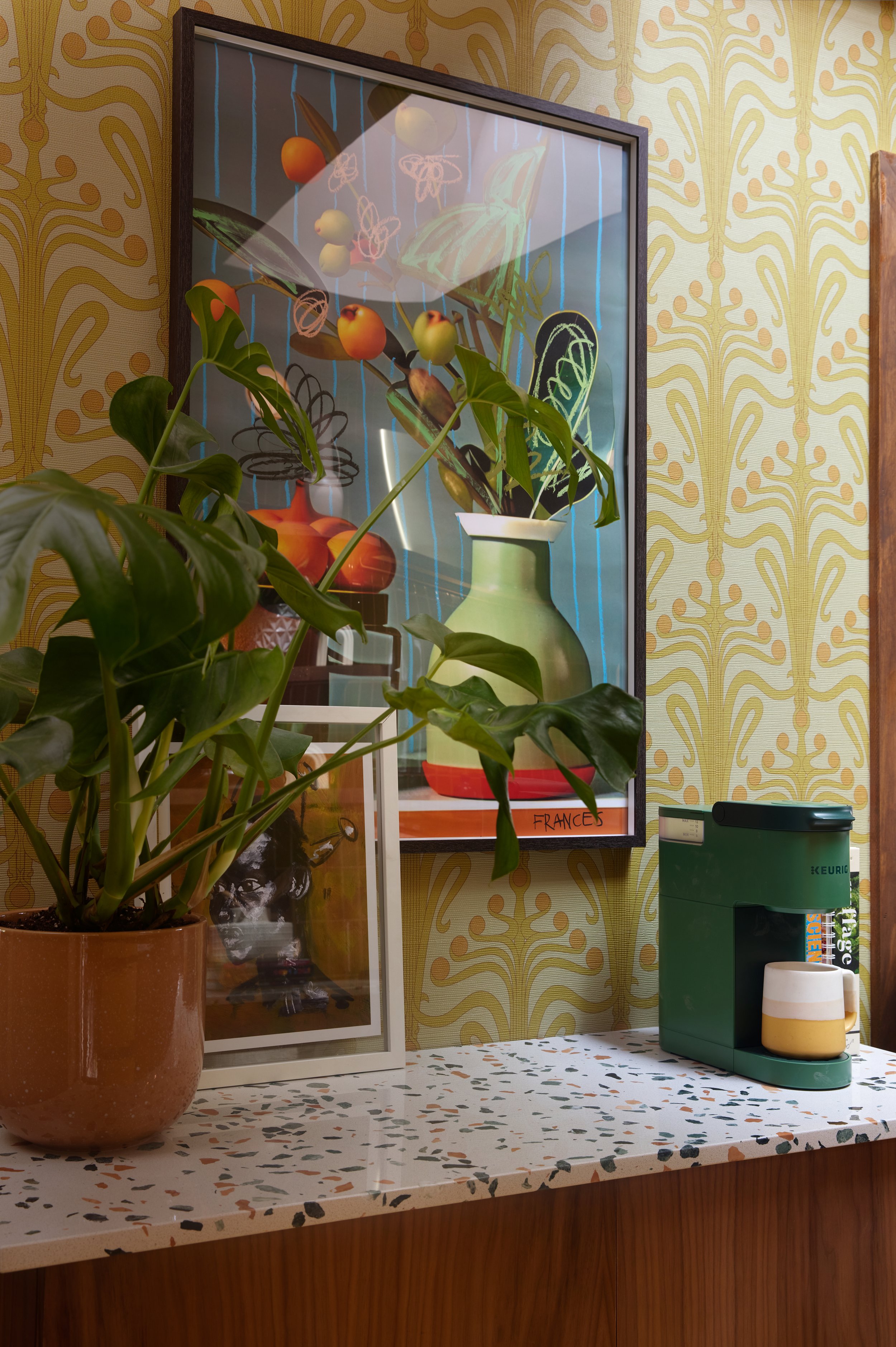
While picking up flowers the day before the kitchen was photographed by Sarah, a good friend of mine - and amazingly talented visionary Frances Berry - texted me, telling me that she had a special gift for me since she saw I wanted a certain piece of artwork that sold out! Coincidentally, the flower shop where I was - Everbloom - is a block away from Frances’ studio! Y’all when I got to the studio, it was the piece I’d wanted for my kitchen! As you see, it couldn’t be more perfect!
And the counters . . . Once I was shown this option at the shop, I completely forgot about my first pick! I promise you, these were meant to be the countertops all along. They just needed me to find them - because they were waiting on me the whole time!
Lucille
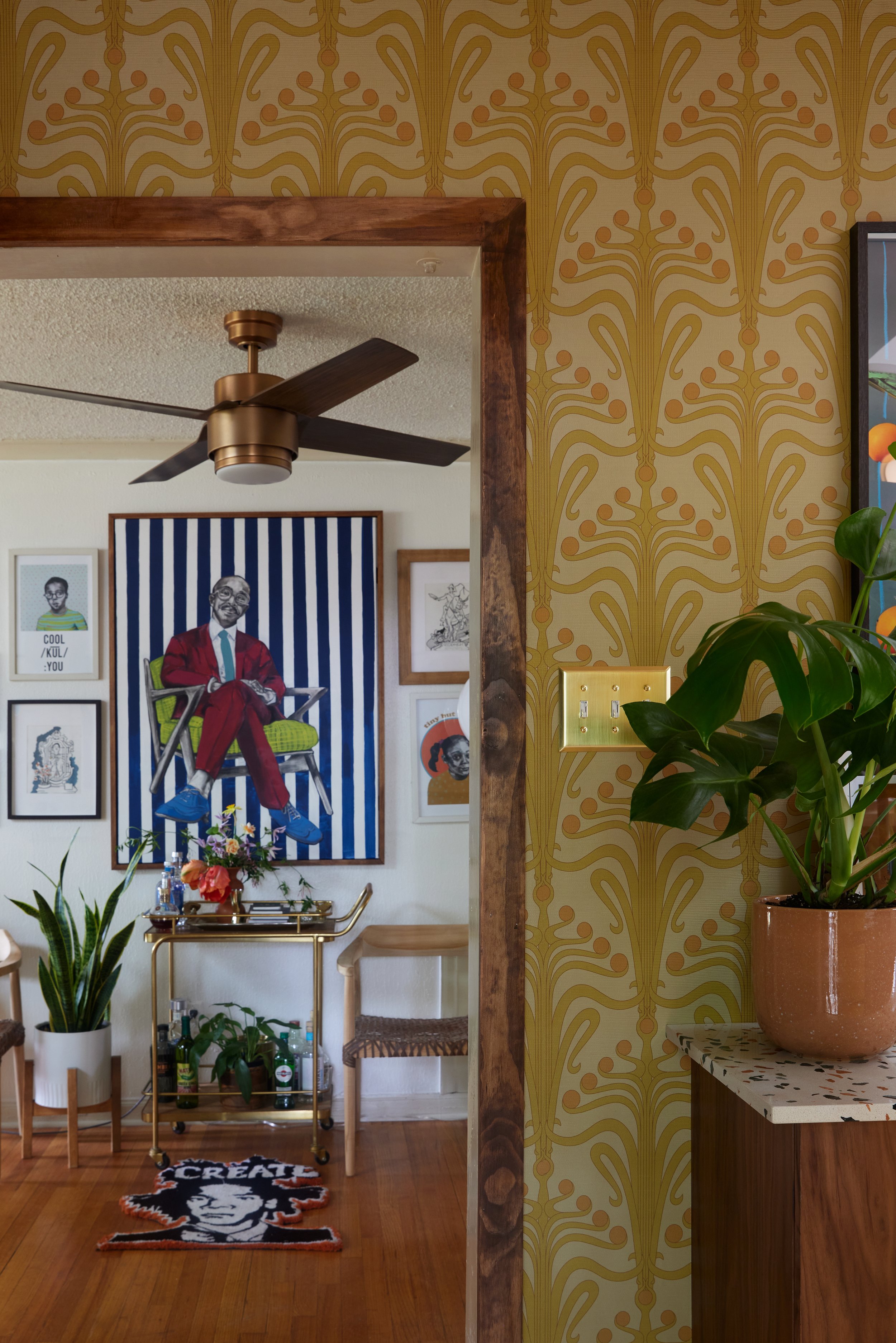
Last, but not least, my wallpaper! Lucille is the wallpaper based on my living grandmother, as part of my Legacy Collection with Chasing Paper. That wallpaper line was developed to honor the matriarchs in my family, and what better way to continue their legacy than having it live on in my home and spaces across the world? This color way is called Citron, and is the faux grasscloth variation.
Hot tip: grasscloth wallpaper is great for spaces where heat and moisture may be present: like bathrooms and kitchens!
How Much Does a Kitchen Renovation Cost?
I’m not going to lie, taking on this project financially was one of the scariest moments in my adult life! This was the first major renovation I’ve done in my home, and the first I’d funded on my own. I was a nervous wreck after making the first payment! BUT, I’d remembered that this was a goal I worked toward for a while and that this was a beautiful investment for my home and future!
However, without the help of some wonderful sponsors, the investment would have been much higher! Here’s a list of items that were either gifted or part of a larger branded campaign:
All appliances - Samsung: part of my Bespoke campaign with the company
Floor and wall tile - Fireclay Tile: they are wonderful partners and their products are top-tier!
Vent hood - Zephyr
Skylight - Velux
Sink - Elkay: y’all, I didn’t know I needed such a deep sink until I saw this one! You’ll see some content coming out about all of its uses in the weeks to come!
Wall sconces “Cadence”- Mitzi: literally my favorite lighting company!
The combined total of their donations alone totaled: $40, 000
With the labor, including contracting services, custom cabinetry, countertops, wallpaper, smaller finishes, new doors and decorative items: $42, 000 (out of pocket).
The overall total for Cocina IV: $82,000
Please note: this financial report is meant only to help you plan for your next kitchen remodel. My goal in sharing this information is to assist you in seeing what your options are, and from there, decide how you want to carry out a renovation - all at once, or in phases.
Lessons and Things to Keep in Mind
As this was my first renovation, there are a few lessons that I learned that I would love to pass on to you just in case you’re about to embark upon your first (kitchen) renovation.
Lesson: Prepare to have another water source - Y’all, the amount of times I washed my dishes in my bathroom sink alone let me know that I should have planned better! If you can, I’d suggest staying with a friend or relatives - or an Airbnb - if having your bathroom and kitchen temporarily become one bothers you.
Lesson: Your house will be a mess - I am a person who loves order, and everything in my home has a place. So, shuffling around a maze of appliances, furniture, plants, and other items took a toll on my order-loving soul. However, I kept in mind that this was only temporary and to achieve my dream space, a little discomfort would take place. Thankfully, my friend, brother, and contractor, James made sure the house was clean after every workday! That within itself offered an incomparable level of peace!
Lesson: You may feel overwhelmed at times - And that I DID, y’all! The renovation just happened to be taking place during the release of my wallpaper line, three campaign shoots, back-to-back travel, the double surgery and hospitalization of one of my parents, the search for a new assistant, AND a major client renovation project in a historic building. So to come home from some of those - sometimes all of those events at once - and seeing my home in slight disarray was overwhelming to say the least. Thankfully, James was the lead/contractor on our client renovation project - so we always had someone to talk to. And on those days when it was all too much, getting back to nature through walks and runs helped out tremendously. Know that life events sometimes like to travel in groups. And sometimes those events can present themselves during renovations. Rather than allowing the stress to consume your mood, just remember your support in friends, and family, and the healing power of reconnecting with nature!
With everything concerning the renovation - I feel that everything that happened, happened just as it should have. Why? Because from this renovation, I gained friends who feel like family while learning so much more about myself in the process! Now, I have a clearer idea of things that make me tick, but also how I can quickly recenter myself to a place of peace and joy. With that, I can hopefully apply those learnings to other areas in life when days aren’t so easy!
A Space Inspired by Love and Light
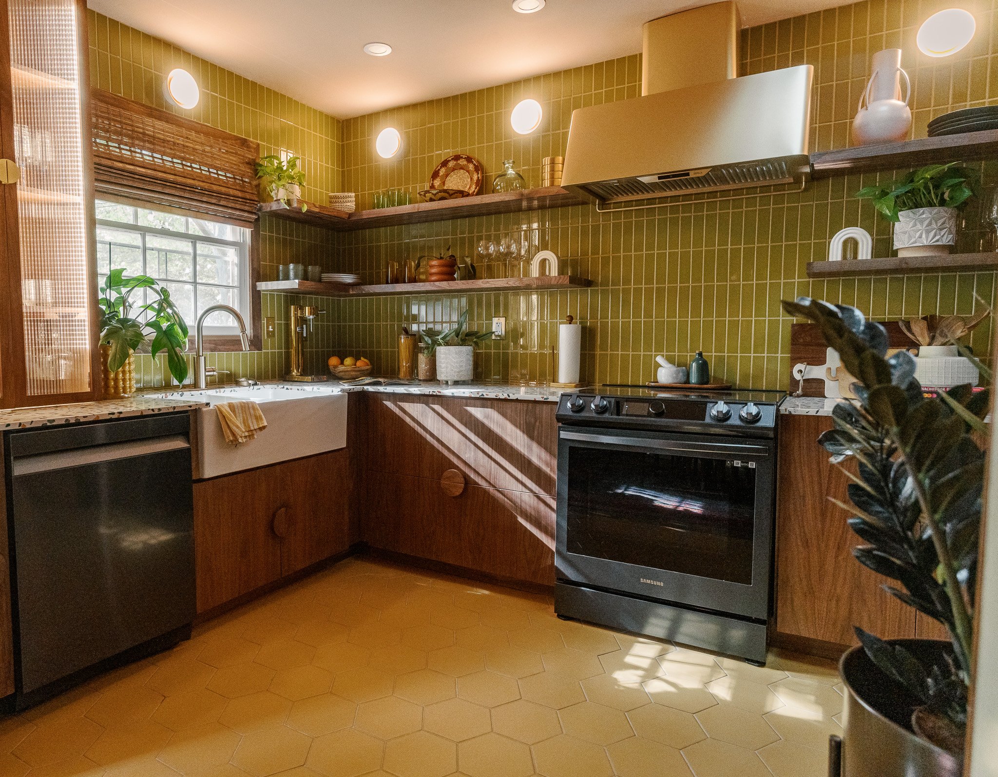
Photography by: Michael Butler
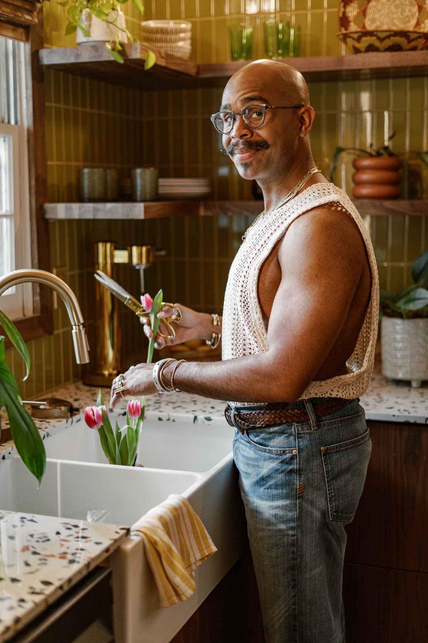
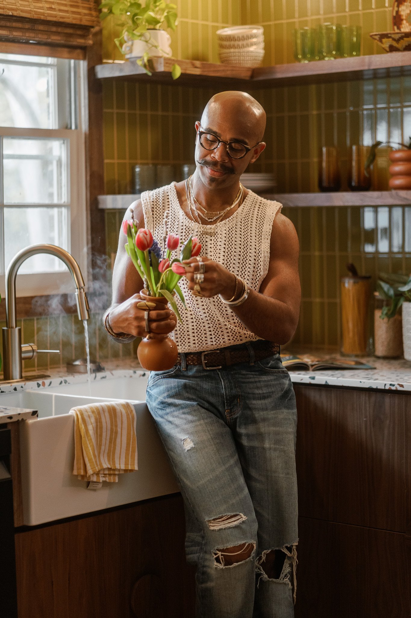
Y’all, now I finally have a place that truly feels like ME; a place where I will make memories of me cooking with my parents, with my friends . . . memories that will last for a lifetime. This is a place where I can’t wait to enter upon waking to make my morning coffee, a place where I will close my nights wiping down my countertops as I dance with a glass of wine, a place where my self-care of watering plants and clipping flowers will form the moments of some of my best days in life. Cocina IV is truly a space inspired by love and light!
Just in case you want to catch up on all of the bts action of the making of Cocina IV, make sure to check out the “Cocina IV” highlight in my Instagram profile, or simply tap here!
A Special Thanks
Photography by: Brian Manning
For bouncing back and forth from our client renovation to my home, nights and weekends to make sure the kitchen met our deadline - James, thank you! For being more than a friend, but a brother - in profession and life, I thank you! Your expertise, willingness to teach and learn, healthfully debate - because those happen with us - and leadership are just some of the things that make you as amazing as you are. Now working together for only two years, it feels like a lifetime worth of lessons learned! Cheers to more adventures and creating some absolutely stunning spaces together!
James - Owner and Contractor of The Pros Contracting
Y’all better get ready as I set out to create some beautiful content in this kitchen! Thank you for reading, and until our next project!
